Spring is a great time to plan a project to refreshen your home. It is a great time to design window treatments for these projects too. There are many benefits and solutions that curtains provide. This post will address a few of them.
If you want to let light into your space but want daytime privacy, then read on. Perhaps you have two windows in a room of various heights. If so, the window treatment solution discussed here will create the illusion they are the same height. Or maybe, your open-concept rooms look disjointed. If so, window treatments may be just what the interior designer would order to unite them!
Benefit #1: Lets Light In but Provides Privacy
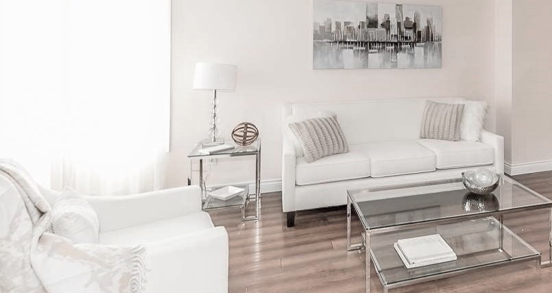
With the increasing emphasis on energy efficiency, you may be looking for ways to let the sunshine and associated heat in. Sheer window treatments are a popular choice for this purpose, as they allow for plenty of light to filter through while still providing some privacy.
Sheers can help you enjoy a light-filled room. And keep those inquisitive eyes away. Their material is thin enough to let the sunshine in and thick enough to block the inside view. They come in a variety of subtle textures. So they can be stylish and still allow light in. As you can see in the photo above, light is coming in from the west-facing window, but people on the street cannot see the room during the day. So you get sunshine and privacy. Click the following link if you want to know more benefits that sheers have to offer. https://lynteriors.wordpress.com/2022/06/06/sheers-for-summer/
Benefit #2: Curtains Visually Unite Windows of Varying Heights
Drapes Provide Solutions for Mismatched Windows
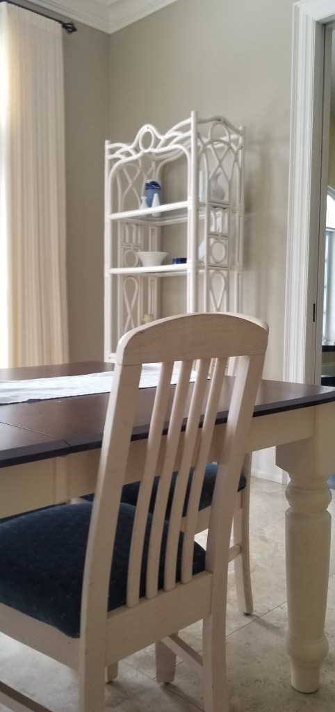
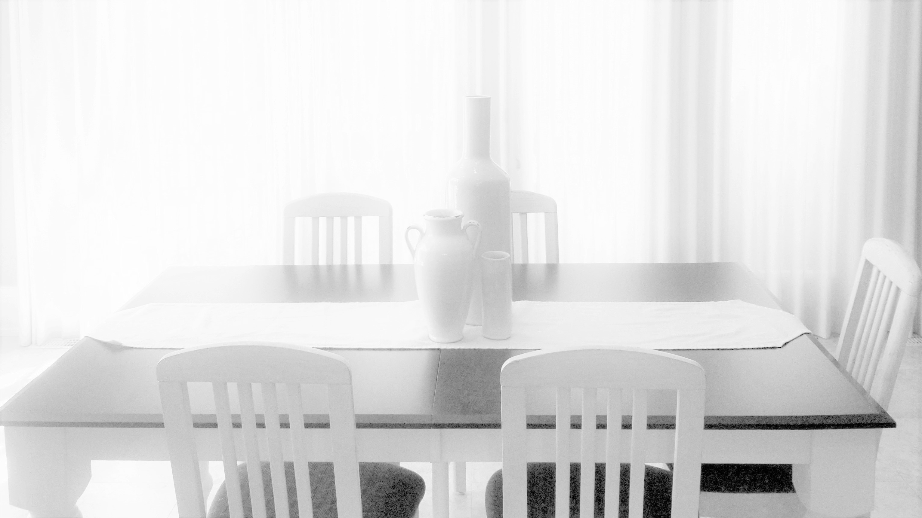
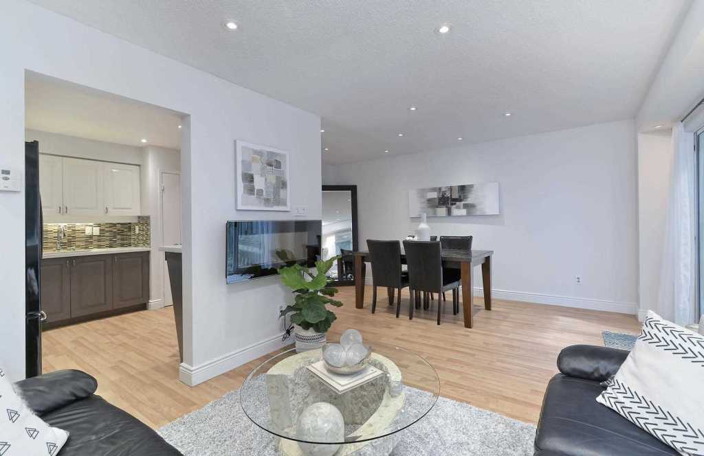
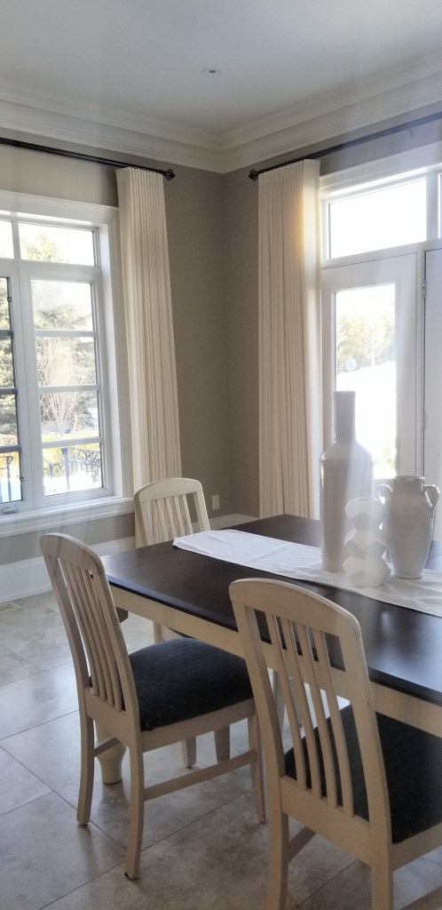
Dressing up windows of different lengths in the same interior space can be challenging. And it is often difficult to dress a room with two windows of varying heights or sizes. For example, the two windows in this breakfast room were installed at different heights. The smaller window is shorter and looks awkward beside the higher French door side window and French door windows. And a lack of window treatments made this situation painfully obvious.
But when the window treatments were installed, the sheers made them appear the same because the height of the poles and thus the sheers are the same. Now both are visually united because the placement of the hardware help to add harmony, so the different window heights are not as obvious. These windows of varying tallness now appear the same because they are draped with similar dimensions. The hardware and sheers have identical vertical dimensions creating an illusion that they are the same height. Are you able to tell that they were different heights?
If you have windows installed at different heights like the ones pictured below, floor-length drapery panels help them look uniform. Also, drapes suspended from a uniform height create an illusion of same-sized windows. You can see what I mean below. You may even want to mount the curtain rods just below the ceiling throughout the room to give the illusion of large, expansive windows and a higher ceiling. This design gave the room a unified look and downplayed the different heights of the windows. The key is to find window treatments that unify their appearance to some degree. So your room has a cohesive, appealing look.
When dealing with mismatched windows, finding the right solution can seem impossible. Since I trained to find solutions for mismatched windows using window treatments, I can help.
Benefit # 3 Drapes Unify Open Concept Rooms
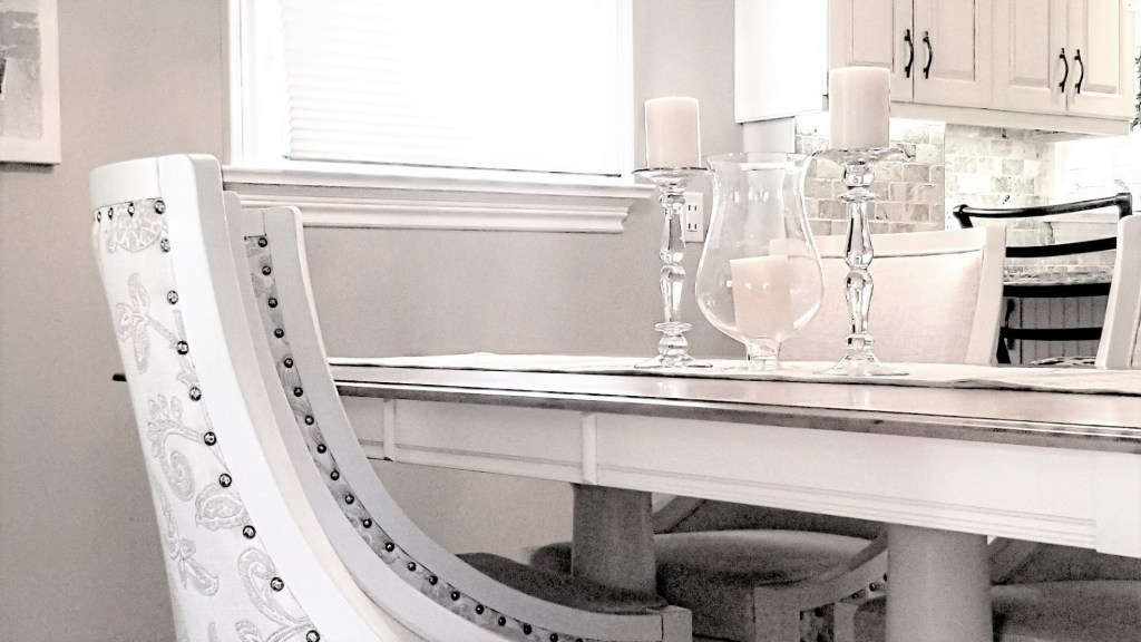
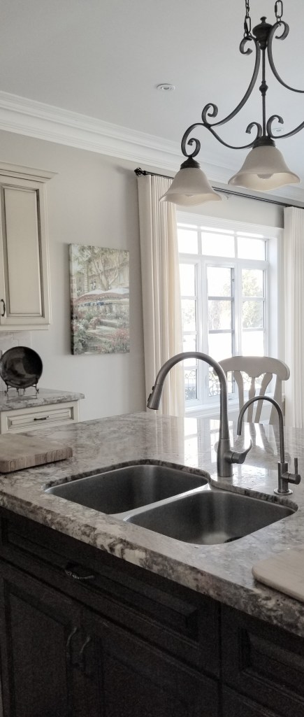
The kitchen island pictured below has a dark chocolate stain finish. But the breakfast room had no dark chocolate decor or architecture. As a result, the colour schemes in the open-plan kitchen and breakfast room looked imbalanced. It was too light in the breakfast room and dark in the kitchen area.
The window treatment hardware with dark chocolate-finished decorative rods added this much-needed contrast to the light breakfast room. And the cream-coloured linen sheers coordinate with the buttery colour of the cabinets.
Furthermore, the ceiling fixture’s urn-shaped ornamentation echoes the finials at the end of the sheer rod. All these details help to unify the two rooms. The colour of the sheers and the poles and finials tie the two open-concept rooms together to create a coherent look. The similar urn shapes of the sheer rod finials and the urn-shaped ornament on the ceiling pendants help to unite the rooms too.
The benefits window treatments provide include: sheers let light in but provide daytime privacy, they provide a solution for mismatched windows, and they help to unify open plan spaces. If you want help decorating your windows, contact me at asburylynn@gmail.com or click the following link to find other ways to contact me. https://lynteriors.wordpress.com/contact-2/