The homeowners wanted a more functional and inviting Toronto condo living room design that would better support both everyday living and entertaining. They needed an end table and coffee table that would allow the couple and their guests to comfortably place beverages and snacks while watching TV or relaxing together.
Because the east-facing living room received limited natural light, the homeowners also wanted to lighten and brighten the space. To achieve this, they hoped to replace their dark-coloured rug and coffee table with lighter furnishings that would help the condo feel more open and airy.
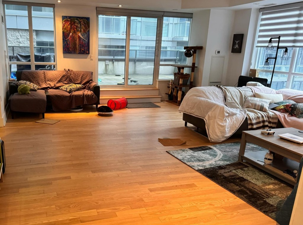
Another major challenge was the condo furniture layout. Although they wanted to keep both of their black leather sectionals, the existing arrangement was not functioning well. One sectional had been placed in a reading nook, while the other was used for TV viewing and entertaining. The disconnected furniture placement made the room feel awkward and less cohesive, so they wanted help creating a more functional, balanced, and welcoming living room layout.
Design Solution: Lighter-Coloured Furnishings
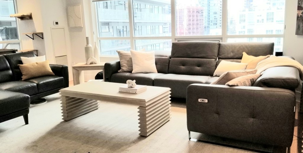
During the consultation, I suggested placing the two sectionals together to create a more cohesive layout for TV watching and entertaining. The homeowners really liked that idea.
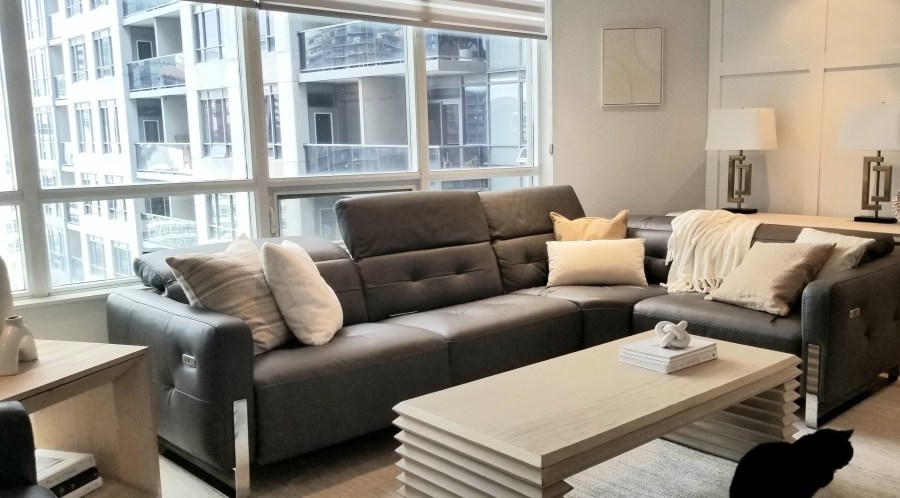
To improve both functionality and aesthetics, I sourced a side table, coffee table, rug, and sofa table so there would be convenient surfaces for beverages and snacks. Lighter-coloured pieces were intentionally selected to help brighten the east-facing room and create a lighter, more inviting feel.
The sofa table also provided space for table lamps, adding another layer of lighting to further brighten the room and enhance the atmosphere.
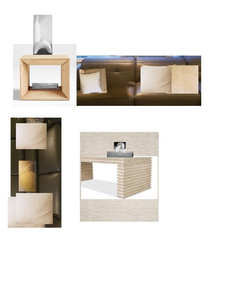
Mood Board
Modified Mood Board
To help the homeowners visualize the overall design direction, I presented the furniture selections and rug together on a sample/mood board so they could see how all the elements would work cohesively within the space.
Later, I updated the board with accessories to preview how the décor would look on the photo and styling day. You can see the styling board above. The design reflects a minimalist style, which the homeowners were naturally drawn to.
The final photo revealed a brighter, more functional, and more cohesive living room. By reworking the layout and introducing lighter-coloured furnishings and accessories plus sofa table lighting, the space immediately felt more open, brighter, and inviting.
The homeowners now had ample surface space for beverages and snacks while watching TV or entertaining guests, making the room both more practical and more comfortable for everyday living.
After with 2 sectionals in living area
Google Review
It’s always a pleasure working with repeat clients. In addition to helping transform their living room, they also invited me to consult on a property they were considering purchasing.
Below is their Google review:
★★★★★
“Super flexible and in tune with our vision. She helped us redo our living room and sourced our furniture. We also used her when looking at new properties—highly recommended!” Click the following link to see the actual google review.https://maps.app.goo.gl/sCDafgVaE3nXfVDX6
My name is Lynn Asbury, an expert interior design consultant, home stager and owner of Lynteriors. I have over 9 years experience renovating, redesigning and stage homes that make homeowners and home buyers say “I like it or Wow” every time they walk into each room.
The rise of Modern Heritage interior design (also known as New Heritage style) reflects a growing shift in how homeowners approach their living spaces. In response to economic uncertainty many are embracing a more timeless, meaningful, and budget- conscious approach to design. This evolving style seamlessly blends traditional design elements, classic architecture, and vintage-inspired details with modern functionality and contemporary furnishings—creating spaces that feel warm, layered, and enduring.
In this post, you’ll learn how to incorporate contemporary décor into a traditional setting, with tips for styling contemporary table accessories with traditional furniture and combining modern wall art with vintage furniture to create a balanced, timeless New Heritage style home.
Blending Modern Table Accessories with Traditional Furniture for a Timeless Interior
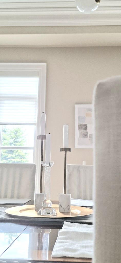
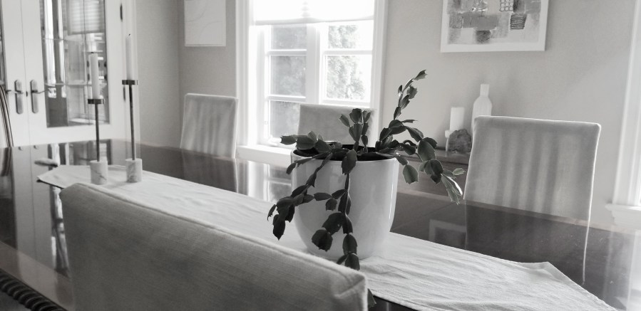
My husband, who is from England, had his heart set on a classic Georgian dining table—something timeless and deeply rooted in tradition. It reminds him of home. To keep the space feeling fresh and current, I layered in contemporary tabletop accessories that not only add contrast but also carry personal meaning.
For example, I was immediately drawn to the modern marble and brass candlesticks from Elte. Their clean, streamlined silhouettes bring a refined, modern edge to the table. What made them even more special, though, was discovering they were made in Italy—a place we had traveled to and loved. That connection made them feel far more personal. And as a bonus, they happened to be on sale, which made the decision even easier.
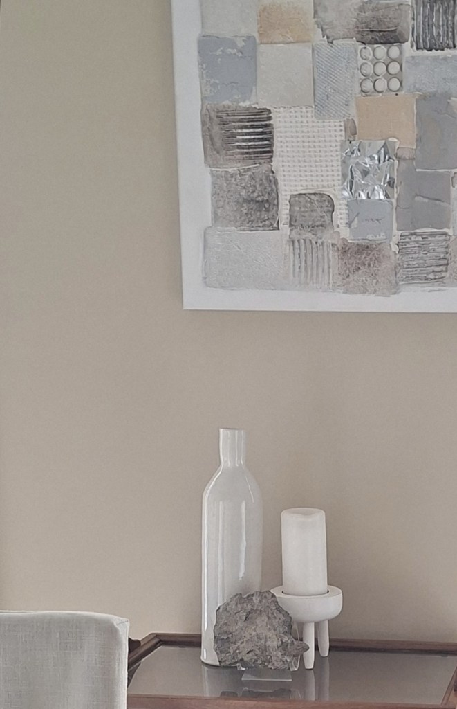
To further layer the space with meaning, I added a handmade vase created by my potter friend Hazel McPhee from Hazel McPhee Pottery, styling it on a vintage tea cart we picked up at an antique show years ago. You can see the vase in the photo below. Every time I see it, it brings back memories of the aerobics classes Hazel and I used to attend together—small, fun moments captured in a single piece.
Over time, I’ve become more intentional about collecting modern accessories that carry personal significance. Since many of our vintage furniture pieces already hold history and meaning, we chose to keep them and layer in newer elements that tell our story today.
These pieces strike the perfect balance: modern in form, yet rich in meaning—helping bridge the gap between classic and contemporary design. I encourage you to mix contemporary accessories with traditional furniture or visa -versa.
Blending Modern Wall Art with Vintage Furniture for a Timeless Interior
Abstract wall art
Art also plays a role here too. Combine modern prints or abstract art with classic furniture to make a bold statement. The modern art is above a vintage tea tray creating instant contrast. The modern tabletop vignette adds to the contrast as well.
Summary
Styling a New Heritage space is all about curating pieces that tell a story. While accessories can be either modern or vintage, in this dining room, contemporary elements were intentionally chosen to balance the traditional foundation. Tabletop accessories and wall art add another layer of depth, helping to bridge the old and the new.
The contrast between contemporary accents and classic furniture brings character and visual interest to the space. For example, modern artwork is thoughtfully placed beneath traditional crown molding and alongside a vintage tea cart—creating a dialogue between eras. On the dining table, a mix of modern and classic candlesticks further reflects this balance, highlighting how old and new can coexist beautifully within the same space.
My name is Lynn Asbury, an expert interior design consultant, home stager and owner of Lynteriors. I have over 9 years experience renovating, redecorating and stage homes that make homeowners and home buyers say “I like it or Wow” every time they walk into each room.
The kitchen is the heart of the home—so it’s no surprise that its design carries so much weight. At the center of it all are the cabinets, shaping the space through their material, colour, and style. In this renovation, the design challenge began with an existing countertop the homeowner loved. Rather than replace it, we built the palette around it. With taupe-gray and greige leading trends in 2026, we selected a nuanced taupe-greige cabinetry finish that not only complements the countertop, but also reveals subtle undertones that shift with the light—creating a space that feels dynamic, layered, and with an ever-changing look.
Greige: A Study in Undertone
In this project, the cabinetry features a warm greige as its primary tone, layered with soft pink-violet and yellow undertones. These nuanced undertones add depth and warmth, allowing the colour to gently evolve depending on the lighting in the room while maintaining a cohesive, balanced look.
A paint colour’s undertone is the subtle hue that sits beneath the surface colour, often only revealing itself under certain lighting conditions. While the main colour—or mass tone—tells you whether a shade falls into the greige, white, beige, or gray family, the undertone is what truly defines how it reads in a space. Hints of blue, green, yellow, pink, or violet can shift a colour’s appearance dramatically based on the lighting.
Warm greige—an artful blend of gray and beige—has become a go-to choice for those seeking a neutral with a touch of warmth. Softer and more inviting than cool gray, it brings comfort to the kitchen while still acting as a versatile backdrop. It avoids the starkness of white without feeling overly bold, striking a thoughtful balance between the two. This makes it an ideal option for homeowners who want warmth without the washed-out effect that white can sometimes create.
In this project, the wife was naturally drawn to this richer tone, ultimately moving away from lighter taupe-greige options that felt too pale and appeared overly white under certain lighting conditions in their kitchen. The selected shade also complemented the gray armchair in the adjacent family room, helping to create a cohesive and harmonious flow between the open-concept spaces.
What are Mid-tone Colours?
The new cabinet colour selected for this kitchen falls within the mid-tone range—but what does that really mean? On a value scale from pure white to deep black, mid-tone colours sit comfortably in the middle, meaning they are neither too light nor too dark. This balanced quality allows them to avoid feeling overly bright and airy like high-key colours, while also steering clear of the heaviness that low-key tones can sometimes create. Mid-tones can bring a sense of comfort and subtle warmth, creating a space that feels grounded, inviting, and almost cocoon-like. In essence, medium-toned colours strike a beautiful balance between coziness and openness.
As you can see, choosing a mid-tone colour palette offers several advantages—especially when creating an atmosphere that feels both comfortable and tranquil. This Benjamin Moore colour, known as Hazelwood, is a perfect example. Sitting between a dark gray and a very light gray, it falls into the category of a medium gray, making it an ideal choice for achieving that balanced, harmonious look while perfectly suiting the homeowners’ preferences.
What Is Taupe?
Taupe is a versatile and sophisticated neutral that blends grey and brown, often with a subtle pink undertone. It’s considered a true “chameleon” colour, adapting beautifully to its surroundings and shifting in appearance depending on lighting .
Exploring Hazelwood by Benjamin Moore as an Example
Hazelwood by Benjamin Moore is a warm taupe, sitting comfortably between grey and beige, with a soft pinkish-purple undertone. This makes it a modern, softer alternative to stark white or cooler grey cabinets. As part of the brand’s Classic Color Collection, it reflects a sense of timelessness and understated elegance.
The name “Hazelwood” evokes natural elements—like hazelnut trees and warm wood tones—giving the colour a grounded, organic feel. This connection to nature makes it especially well-suited for creating warm, inviting spaces such as kitchens. Much like the trunk and branches of a hazel tree, which can appear pinky-grey or pinky-beige depending on the sunlight, this colour shifts in a similar way within a room. Overall, this shade reflects the growing design preference for warm, earthy, and nature-inspired tones—bringing a sense of comfort into the home. It responds to changing light conditions, reinforcing its chameleon-like quality.
As a medium-toned taupe, it helps create a soothing, warm ambiance—more of a tranquil retreat than a stark, cold modern space. Its inherent warmth brings a cozy feel, pairing beautifully with the wood flooring and existing countertops in the room. This subtle richness allows the space to feel balanced and inviting, rather than overly sharp or sterile—creating a space that is not only visually appealing but also emotionally comforting and welcoming.
Why does the Same Kitchen Cabinets Appear to have a Different Colour
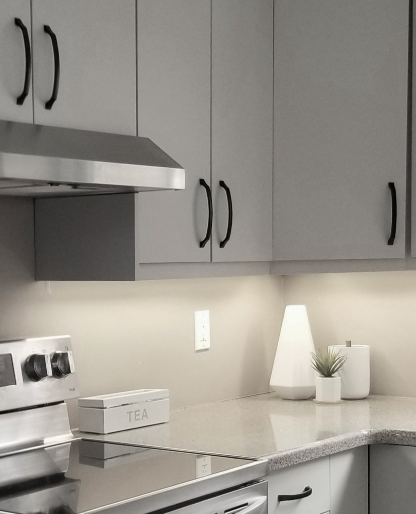
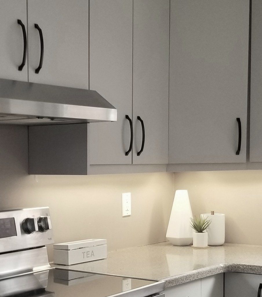
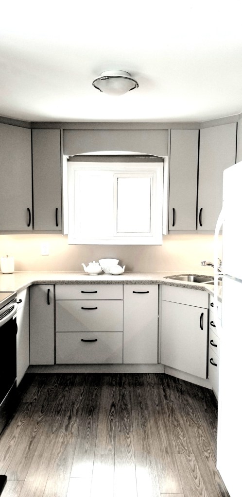
As you can see in the photos below, the exact same kitchen cabinets can appear to be different colours. Why is that? It’s because Hazelwood contains both beige and gray in a well-balanced way, along with subtle pink undertones and even a hint of yellow.
As a result, it can read as a pinky beige in some moments and a pinky gray in others—depending on the natural light entering the space and the artificial lighting from under-cabinet lights, ceiling pot lights, or overhead fixtures. The colour temperature of the bulbs plays a key role in how these undertones are revealed.
Read on to learn more about how colour temperature influences what you see in your space.
Warm Gray KitchenTaupe Beige Kitchen, photo by Reza Alamdari
Why Bulb Colour Temperature is Important?
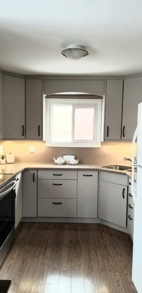
This particular Benjamin Moore colour can appear as a mid-toned taupe-gray in one setting (see the photo above on the left), and shift to a softer, lighter taupe-sandy beige (see the photo above on the right) when a different lighting source is introduced. It’s truly a chameleon shade, changing its colour dramatically depending on the room’s lighting—specifically the colour temperature of both natural and artificial light.
Interior lighting plays an important role in balancing the light coming from outside—whether in terms of quantity or temperature. This is where Kelvin (K) comes in. Lighting colour temperature, measured in Kelvin, directly influences how kitchen cabinet colours appear by either warming or cooling them.
Warm coloured light bulbs(lower Kelvin values) that give off a yellow colour enhances reds, yellows, and wood tones, allowing them to blend harmoniously, while colder light (higher Kelvin values) makes surfaces appear crisper, more defined and enhances grays and blue colours – Kelvins therefore indicates the colour of the light being emitted. Understanding this can make a significant difference in how colours like Hazelwood are experienced in your space.
The ceiling fixture and pots lights have bulbs with around 3000K. So in the evening when these light fixtures are turned on the warm pinky beige colours in the cabinets are revealed and you get the mushroom beige colour look that is trending now.
When the neutral-cool 4000K under-cabinet strip lighting is turned on only—often considered a balance between warm and cool light—it shifts the cabinet colour toward a more taupe-gray rather than beige. Similarly, when natural light is cooler, such as on an overcast, grey January afternoon (like in the photo), the cabinets can read noticeably more gray. In this case, it’s the combination of cooler natural light and cooler artificial lighting that creates that taupe-gray appearance in the kitchen.
As you can see, the colour temperature of your light bulbs can make a significant difference in how colours appear within your space. One of the advantages for these homeowners is the flexibility this creates—they can subtly influence how their kitchen looks simply by adjusting their lighting. When it comes time to sell, they even have the unique opportunity to highlight the version of the colour that best aligns with current design trends.
Summary:
Taupe kitchen cabinets that are neither too dark nor too light represent that rare intersection of aesthetic sophistication and practical performance. Their subtle complexity adds visual interest without overwhelming a space, while their mid-tone balance helps them stand up to the demands of daily living—partly because these mid-tones are better at concealing everyday dirt, dust and grease. This thoughtful blend of beauty and functionality helps explain their enduring appeal. A must if you do not want to clean kitchen cabinets frequently.
Hazelwood by Benjamin Moore is a particularly complex shade, often described as a warm taupe-greige. Because of this, it behaves like a chameleon under different colour temperature conditions. This gives you the unique ability to influence how the colour reads—whether leaning more gray or more beige—simply by adjusting your lighting. It’s a subtle but powerful advantage, especially when preparing a home for sale, as lighting can be used to highlight the most on-trend look at the time. These homeowner are considering moving soon so this will benefit them and maybe you if you are considering painting your cabinets this colour.
Just in case you were wondering, the owners refaced their cabinets and chose slab panel cabinets. If you’d like to learn about the slab panel cabinets featured in this kitchen project—and their benefits—click the link below.
My name is Lynn Asbury, an expert interior design consultant, home stager and owner of Lynteriors. I have over 8 years experience renovating, redecorating and stage homes that make homeowners and home buyers say “I love it or Wow” every time they walk into each room.
The heart of every home—the kitchen—continues to evolve, reflecting changes in lifestyle and design preferences. More than just a place for cooking, today’s kitchens are multi-functional spaces designed for gathering, connection, and strengthening family bonds. It’s where your day begins with a glass of water, tea, or coffee while breakfast is prepared. It’s where meals are created and shared with the people you love. In many homes, the kitchen has become the primary communal space—even more so than the living or great room—where guests naturally gather and conversations flow while dinner simmers on the stove. As the most frequently used room in the house, it’s no surprise that we call it the heart of the home.
A thoughtfully planned kitchen renovation can turn this essential space into one where everyday tasks feel easier and more enjoyable—while meeting your unique needs and lifestyle. Not surprisingly, the kitchen remains one of the most popular rooms to renovate, often offering one of the highest returns on investment in the home.
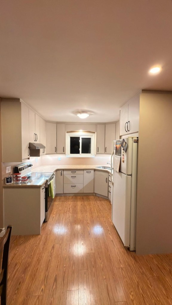
Project Aurora: Before and After
Kitchen cabinets play a crucial role in both the design and functionality of a contemporary kitchen—and Project Aurora by Lynteriors is a perfect example. Take a look at the photos below to see the transformation.
In this Aurora home, the cabinet stain on frequently used doors—such as the cutlery drawer—was beginning to wear down. Also, the homeowners were tired of constantly removing dust and grime from the cabinet surfaces. As she put it she wanted “something sleek that was easy to clean.” To address these concerns, the Aurora homeowners chose kitchen cabinet refacing rather than a complete full replacement.
BeforeAfter
Cabinet Refacing: A Cost-Effective Solution with Reduced Renovation Time
Cabinet refacing is a popular kitchen remodeling solution that transforms the look of your kitchen with Lower Cost Than Full Replacement. Instead of removing existing cabinet boxes, this cosmetic upgrade focuses on updating the exterior surfaces—including cabinet doors, drawer fronts, and finishes—while keeping the original cabinet structure intact.
Because the existing cabinet shelves and drawers were in excellent condition, thanks to careful homeowner maintenance, refacing was the ideal choice for this project. By preserving the cabinet framework, you can achieve a brand-new kitchen appearance at a fraction of the cost of installing new cabinets.
Furthermore, this approach delivers a fresh look with less disruption and reduced renovation time. For example, in this particular project, the work was completed in just under five days, and the homeowners were able to use the kitchen throughout the entire process!
Benefits of Slab Panel Kitchen Doors
1. Easier to Clean and Maintain For these homeowners, the goal was a lifestyle shift toward less cleaning and maintenance. They wanted a streamlined, low-maintenance kitchen with surfaces that are simple to care for in everyday life—so they chose slab panel doors. If easy, day-to-day upkeep is important to you as well, flat-panel cabinet doors are an excellent option. Their smooth, unembellished surfaces minimize dust buildup and make wiping them down quick and effortless. This easy maintenance is one of the key reasons slab cabinets continue to grow in popularity.
2. Supports Contemporary Design and Creates a Bright, Spacious Feel Flat-panel cabinets, also known as slab doors, feature a single, solid flat surface without framing or ornamentation. This creates crisp, clean lines that define modern and contemporary kitchen design. The uninterrupted surface also reflects light more evenly, helping the kitchen feel brighter and more open—an especially valuable benefit in smaller spaces.
3. Slab-Panel Doors are Budget-Friendly
Flat panel cabinets are often one of the most budget-friendly styles available, making a contemporary look accessible without sacrificing quality. Their simple, elegant design requires less manufacturing complexity than more ornate styles, which translates into savings for you.
In addition, if your existing cabinet boxes are high-quality, structurally sound, and well-maintained as was the case with these homeowners, they don’t need to be replaced. By combining cabinet refacing with durable, cost-saving slab doors, these homeowners saved approximately 50% compared to a full cabinet replacement renovation.
Is Cabinet Refacing Right for You?
Refacing kitchen cabinets is a smart and efficient way to breathe new life into the heart of your home. By updating doors and drawer fronts while keeping the existing cabinet structure, homeowners can achieve a fresh, modern look without the cost, mess, or downtime of a full renovation. As shown in Project Aurora, thoughtful surface-level changes such as refacing with slab panel doors can dramatically improve both style and functionality—especially for those seeking a sleek, low-maintenance space. When the bones of your cabinet boxes are in great shape, refacing offers a practical, budget-friendly solution that transforms your kitchen into an appealing, and welcoming space where everyday life unfolds. For homeowners seeking an affordable kitchen upgrade with maximum visual impact, cabinet refacing with slab panel doors is a wise and stylish investment. If you want to learn more about refacing or have questions do not hesitate to reach out by clicking on the button below.
In the next post, we’ll take a closer look at why the slab panel doors in this kitchen sometimes appear gray and other times beige — as you can see in the two photos below. We’ll break down how lighting and subtle undertones influence the way this color is perceived in this kitchen, and why it can shift so noticeably throughout the day.
My name is Lynn Asbury, an expert interior design consultant, home stager and owner of Lynteriors. I have over 8 years experience renovating, redecorating and stage homes that make homeowners and home buyers say “I like it or Wow” every time they walk into each room.
Modern Heritage interior design—also known as New Heritage style—is one of the top interior design trends for 2026. This timeless design approach bridges the gap between classic and contemporary interiors, blending historical character with modern lines and appeal.
Rooted in British and early Colonial design, Modern Heritage style combines traditional architectural details, fixtures and furnishings—such as crown molding, mill work, and furniture—with modern, minimalist, or softly rustic furnishings and fixtures. The result is a layered look that 33feels both refined and livable.
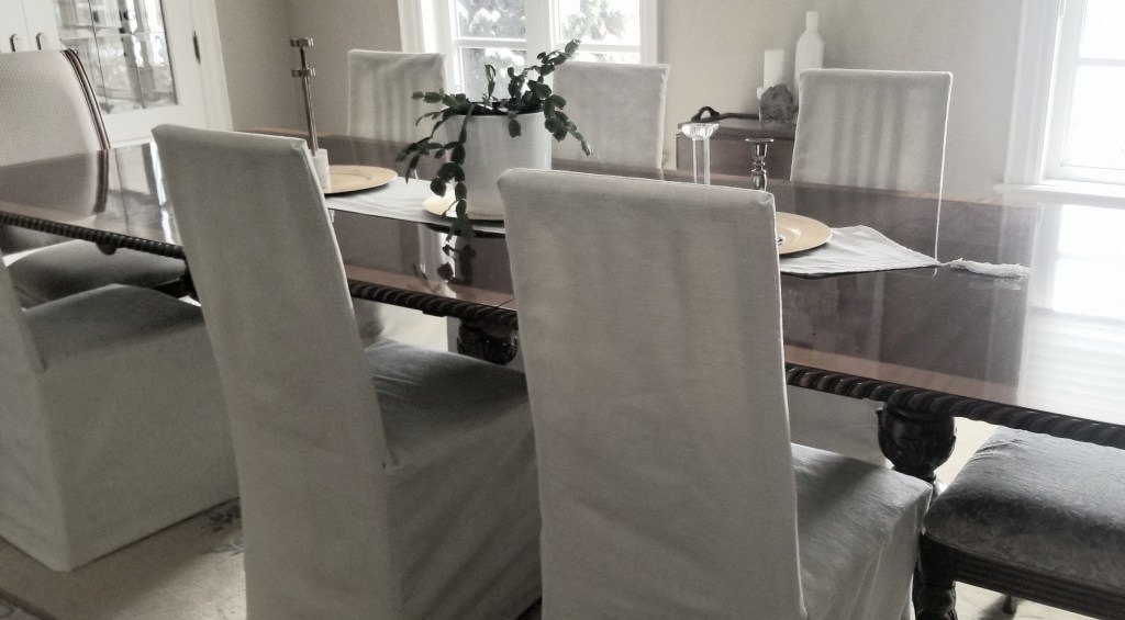
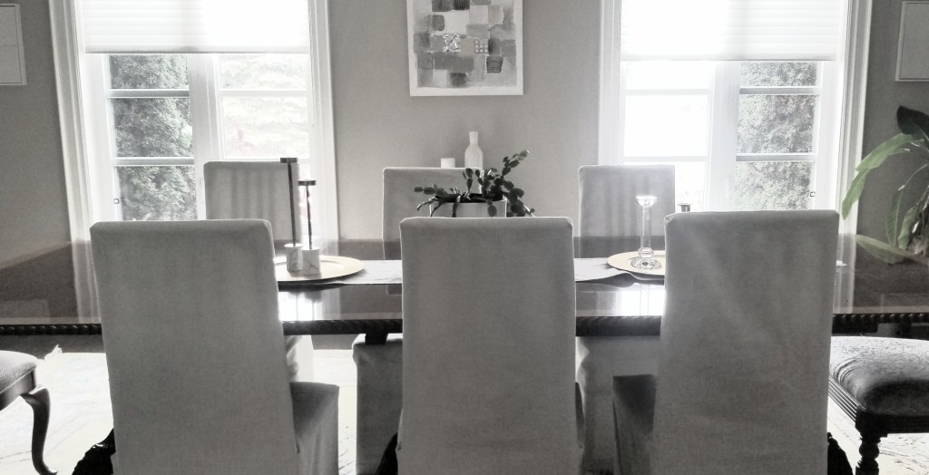
Modern Heritage interiors come to life when vintage and antique pieces are thoughtfully paired with contemporary elements. A vintage dining table—like the one pictured above—adds warmth, craftsmanship, and authenticity, qualities often missing from modern pieces. This style is about honouring the past while designing for modern living.
Ideal for homeowners who love classic interior design but want a space that feels light, airy, and updated, Modern Heritage draws inspiration from the Georgian and Victorian eras, celebrating artistry, symmetry, and attention to detail.
At its core, Modern Heritage interior design is the art of layering old and new—blending traditional furniture with clean lines, natural materials, soft textures, and contemporary art. In the photo below, the traditional dining table and hostess chairs are paired with contemporary accessories and modern wall art, creating visual contrast and balance. This mix of classic and contemporary design results in a home that feels timeless and enduring—ideal for homeowners seeking a refined balance between traditional style and modern living.
Difference between Modern and New Heritage Style
New Heritage style enhances the traditional European features of a newly built or relatively new traditional-style property by thoughtfully introducing modern and contemporary elements that elevate its original design.
Modern Heritage style, on the other hand, celebrates the authentic architectural details of an older or historic home, layering in modern and contemporary elements to complement—rather than compete with—its original character.
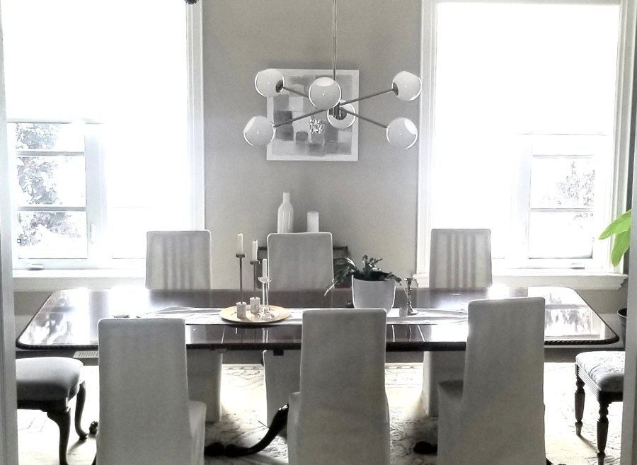
I believe in honoring the past while embracing the present, and Modern Heritage (or New Heritage) interior design allows me to do exactly that. My husband gravitates toward Georgian style, and rather than choosing one aesthetic over another, this approach creates a beautiful middle ground. If you’ve ever felt torn between traditional and modern—or you’re a couple with different design preferences—Modern Heritage may be your happy medium too. It gives you permission to keep your Georgian dining table, pair it with a 1950s Sputnik ceiling fixture like the one pictured below, and layer in contemporary pieces that feel just as storied and intentional.
Balance Old and New: Pair a traditional ornate mahogany Georgian dining table with modern slip-covered chairs , like the ones shown in the photo above, to create contrast and visual interest. This blend of classic craftsmanship and contemporary design is a hallmark of Modern Heritage interior style, delivering a look that feels timeless yet current.
Dining room with sputnik ceiling fixture
2 Design Principles for New Heritage or Modern Heritage Style
Balance Old and New: Pair a traditional ornate mahogany Georgian dining table with modern slip-covered chairs , like the ones shown in the photo above, to create contrast and visual interest. This blend of classic craftsmanship and contemporary design is a hallmark of Modern Heritage interior style, delivering a look that feels timeless yet current.
Choose a Neutral Colour Palette: Shades of beige, cream, warm white, and taupe are chosen deliberately to create a timeless Modern Heritage interior. These neutral tones provide a versatile backdrop, allowing rich historical influences to shine. In the photo above, a taupe-painted wall complements warm white slip-covered 1980s chairs, with white accessories and wall art thoughtfully layered throughout the room.
Summary
Modern Heritage style celebrates history and craftsmanship by blending well-loved, story-rich pieces with contemporary furnishings. Key elements include balancing old and new, a neutral colour palette, and modern-silhouette furniture—sometimes slip-covered—for comfort and flexibility. To learn more about the benefits of slip-covered dining chairs, click the button below.
My name is Lynn Asbury, an expert interior design consultant, home stager and owner of Lynteriors. I have over 8 years experience renovating, redecorating and stage homes that make homeowners and home buyers say “Wow or I like it” every time they walk into each room.