Textures are valuable assets in your affordable interior design toolbox. They are frequently used in interior design to add contrast and visual interest to a space. Texture is not only about how decor and soft furnishings feel, but texture also includes visual texture. Texture refers to the surface of a fabric, including how it looks and feels when touched. Adding throw pillows to your decor can also increase the texture of a space, making it more tactile and visually appealing. Without texture, a space can appear flat and one-dimensional. Including textures helps to prevent this from happening.
Textures such as fabrics can add physical comfort, warmth, an organic element, and visual interest to a space. Like colourful throw pillows, textures on the textiles can also bring style to a room. It works in even the most minimalist of spaces and designs. When it comes to visual texture, the texture of the fabric can appear smooth, nubby, slubby, velvety, woven, or rough.
They are a must-have in a white or neutral-coloured room as they provide depth. To give your space a captivating look, use a variety of textures. The material’s feel and appearance impact the atmosphere you’re trying to create. A room with different shades of white can lack visual interest unless you introduce different textures. So texture is the key to adding interest to a predominantly white area.
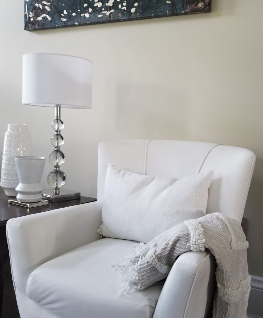
Furthermore, when designing a room with a monochromatic colour scheme, to add interest, it’s important to incorporate different textures. For example, when I decorated my great room with a green monochromatic colour scheme, I realized it needed some texture to prevent it from appearing flat. To create contrast against the smooth and grainy-looking leather and the smooth velvet furniture in the room, I had a white boucle and linen throw pillows made. I created visual depth and interest by mixing pillows with different textures.
The photo below of the nubby or knobby boucle pillow with the slubby or uneven woven-looking linenpillow sitting side by side on our leather sofa adds depth and dimension to our great room. As you can see from the photo, throw pillows can add texture and dimension to a space, transforming it from flat and bland to rich and inviting. Combine furnishings with smooth velvet textures such as armchairs with pillows featuring textured weaves such as boucle and linen. The contrast adds dimension and makes the arrangement more visually appealing. They provide a sensory experience, making your space feel more luxurious and inviting.
The textured boucle and linen throw pillows on the leather sofa
The photo above of the nubby or knobby boucle with the slubby or uneven woven-looking linen sitting side by side on our leather sofa adds depth and dimension to our great room. As you can see from the photo, throw pillows do indeed add texture and dimension to a space, transforming it from flat and bland to rich and inviting.
Linen Throw Pillows
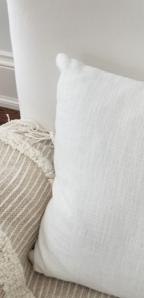
As seen in the photo below, the linen pillows and boucle throw blanket with a rough texture stood out prominently against the velvet furniture. The velvet armchair had a plush raised pile, which gave it a luxurious look and a soft and smooth feel. The contrast between the velvet and slubby texture of linen added interest to the armchair and the room. Linen has a woven texture created by thickened yarn in random areas, resulting in an uneven or rough-looking texture. These thickened and raised areas add visual interest. However, the linen blends, like the lumbar pillow mentioned here, are often luxuriously smooth and soft to the touch.
The pillow has a relaxed, casual, yet sophisticated feel that makes it perfect for a great room or family room. The slubby, rough woven textured linen lumbar pillows add a contrasting texture to the smooth-looking velvet armchair behind it.
Boucle Throw Pillows
Bouclé fabric is known for its unique look, characterized by a curly and knotted appearance. The loops in the yarn create a more rough and textured surface that is visually appealing. The loops are easily visible, creating a nubby texture that sets bouclé apart from other textiles. This fabric has a fuzzy appearance that adds to its sophistication and luxury. Bouclé’s textured appearance gives it a distinctive and rich look unmatched by other fabrics.
The texture of bouclé fabric creates an alluring surface that invites touch. Despite its knobby or lumpy appearance, it feels soft to the touch. The photo above shows a boucle pillow with its characteristic knobby or popcorn-like appearance. And despite its coarse texture appearance, the loops provide a plush and cozy feel, making it exceptionally comfortable to lean against or touch. Bouclé fabric offers a welcoming and comforting experience, and boucle fabrics add an element of coziness to home decor items like throw pillows.
Combining bouclé fabric with other materials, such as leather and linen, can create a beautiful contrast and add depth to any design. In the photo below, you can see the subtly- grainy but smooth texture of our leather sofa. The leather sofa contrasts with the highly textured nubby bouclé throw pillow and the slubby linen pillow. These textures combined can add a magical touch to any room.
The textured boucle and linen throw pillows on the leather sofa
Summary:
Throw pillows are a great way to add texture to your room. You can mix pillows with different textures to create more visual interest and depth in your room decor. Combining pillows made of different textured weaves, such as boucle and linen, can create a lovely effect when placed against the smoother textures of velvet or leather, as shown in the post. By selecting pillows with various fabric textures, like linen and boucle, you can achieve a multi-layered look that is visually appealing and adds depth to your room’s design. Additionally, textured pillows offer a tactile experience that adds another layer of comfort to your room.
Despite the current economic climate, there are ways you can attain a beautiful home. The secret is to add throw pillows to your space. They are a cost-effective way to enhance your living space. By incorporating some well-selected throw pillows, you can effortlessly introduce texture and colour to your rooms, resulting in a luxurious and welcoming ambience. You don’t have to undertake expensive renovations to attain a beautiful home interior. Minor updates can create a significant difference over time, and the advantage of using throw pillows is that they offer an economical way to make an impact. It is one way to completely change the look and feel of your home without touching any of your existing furniture.
Definition of Throw Pillows
So, what is a throw pillow? Throw pillows are a type of soft furnishing that is used to enhance a room’s comfort, style, and ambiance. These textile-based decor items, including throw pillows, are designed to add colour, comfort, and texture to a sofa or bed. They serve both functional and aesthetic purposes in interior design. In simple terms, a throw pillow is a decorative cushion or accent pillow used to add beauty and comfort to a room.
When decorating with throw pillows, one of the most exciting aspects is the ability to mix and match different colours and textures. When you carefully select and arrange a collection of throw pillows, you can create a visually appealing and stylish look. In this context, let’s explore two tips and ideas or two aesthetic purposes for using throw pillows:
the first tip is to use them to support the colour scheme of your room
the second tip is to use them to add texture to your space.
#1: Pillows Support the Colour Scheme
Colour coordination of a colour scheme is a crucial element of interior design. It refers to the art of blending the colours of various items in a room to form a cohesive and visually pleasing appearance. If executed correctly, colour coordination can help to create a feeling of warmth and comfort in a room. Throw pillows can help with colour coordination. Since throw pillows add colour to a room, they are a cost-effective way of achieving a harmonious colour scheme that ties the room together and helps with colour coordination.
Analogous Colour Scheme
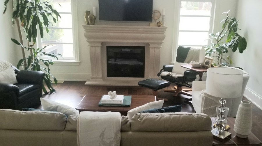
Example of a family room with a dark-yellow and green analogous colour scheme.
Homeowners, like yourselves, often have different colour preferences, which I have found holds in my home. My husband likes warm and cozy colours like yellow or orange, while I prefer neutral colours like white because it provides a light, airy and peaceful atmosphere. To satisfy our preferences, I added a mix of warm-coloured white pillows to the furniture in our great room. Surprisingly, the decorative pillows reflect my husband’s and my personality and preferences. So we feel more comfortable in the room. Ultimately, the interior design of a room should be a reflection of both your personalities and preferences.
This room has neutral colours such as beige, brown and white but also an analogous colour scheme involving yellow and green. The yellow, dijon mustard-colour and green home decor items help tie the room together. For example, in the photo, you can see a light mustard-yellow pillow on the sofa, which is barely noticeable. The light mustard-yellow pillow helps to tie in the light yellow metals in the room, creating a colour rhythm that helps bring harmony to the room.
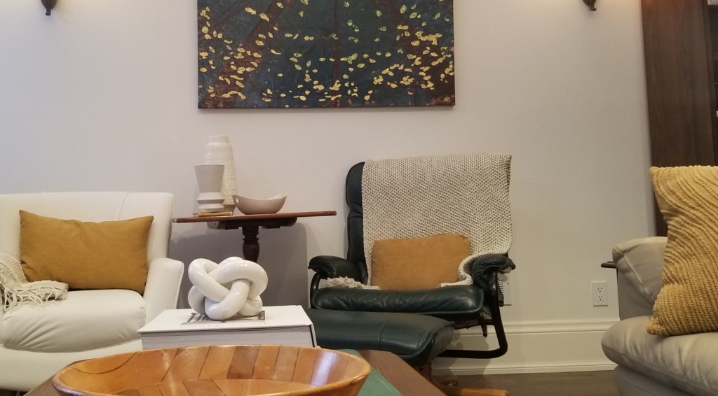
Here is the same room with the chairs moved around. We interior designers love to move home furnishings around! As you can see in the photo below, the darker mustard-yellow coloured portions of the bowl and mustard-coloured throw pillows create another colour rhythm. The dark and light mustard-coloured throw pillows play an important part in tying all these design pieces and, thus, the room together.
Monochromatic Colour Scheme
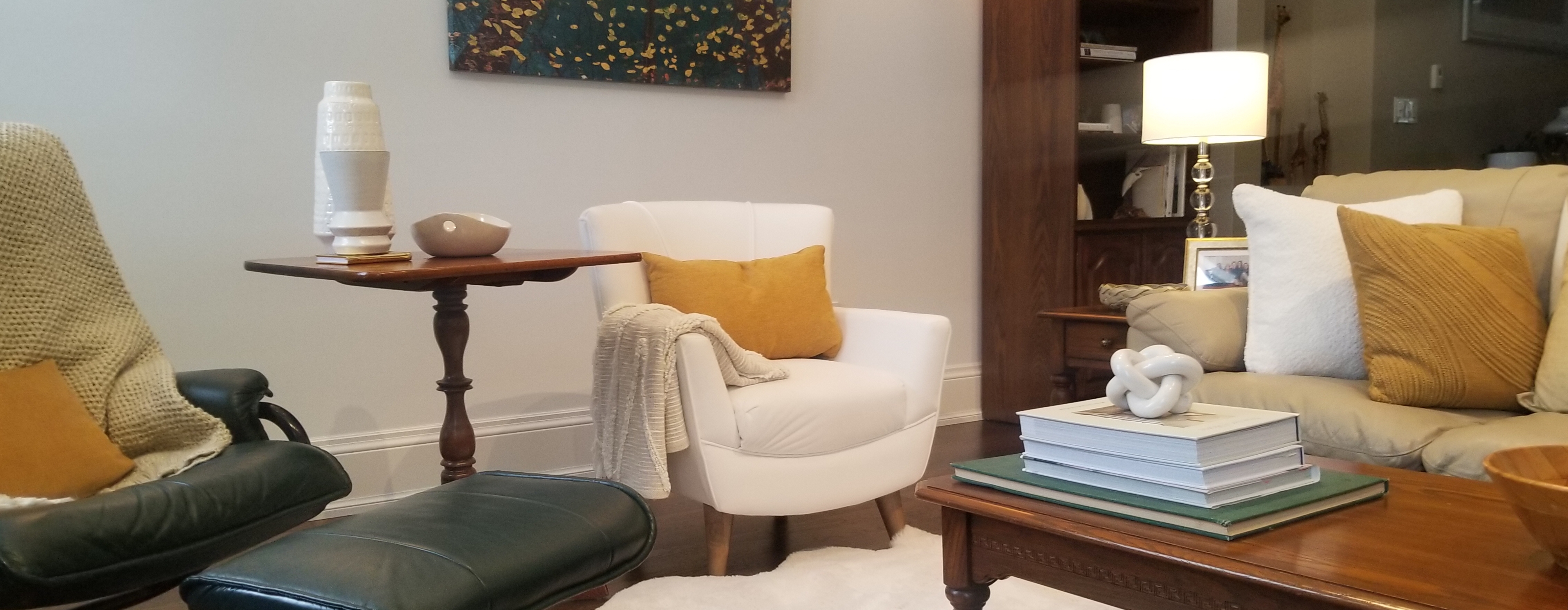
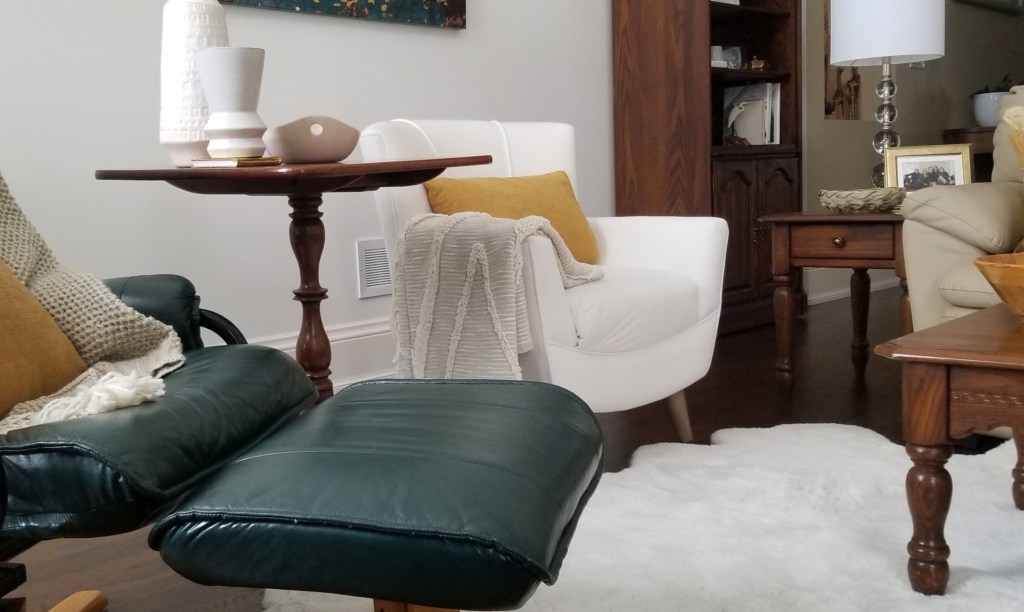
Below is an image of the same room with a monochromatic green colour scheme. The armchairs are rearranged, and the view of the room is slightly different. However, despite these changes, the room remains the same as before. Every other colour in the room is neutral, such as white, beige and brown.
In this version of the room, the pillows have a white and green colour scheme. Various shades of green are on the furniture, wall art, plants, and one of the books on the coffee table. This colour combination creates a minimalist and restful look. The only significant difference between the two rooms is the colour of the throw pillows.
As you can see, the colour of the throw pillows can significantly affect the mood, style, and colour scheme of the room. Furthermore, you can create a cohesive look by matching your pillows with your furniture, walls, or decor accents, as I did in our family room pictured below. Which of the two rooms do you prefer? The room is undergoing redecoration, and I plan to add a new rug to complete the look. So stay tuned for that post.
#2: Textured Throw Pillows Add Interest
Textures are valuable assets in your affordable interior design toolbox. They are frequently used in interior design to add contrast and visual interest to a space. Texture is not only about how decor and soft furnishings feel, but texture also includes visual texture. Texture refers to the surface of a fabric, including how it looks and feels when touched. Adding throw pillows to your decor can also increase the texture of a space, making it more tactile and visually appealing. Without texture, a space can appear flat and one-dimensional. Including textures helps to prevent this from happening.
Textures such as fabrics can add physical comfort, warmth, an organic element, and visual interest to a space. Like colourful throw pillows, textures on the textiles can also bring style to a room. It works in even the most minimalist of spaces and designs. When it comes to visual texture, the texture of the fabric can appear smooth, nubby, slubby, velvety, woven, or rough.
They are a must-have in a white or neutral-coloured room as they provide depth. To give your space a captivating look, use a variety of textures. The material’s feel and appearance impact the atmosphere you’re trying to create. A room with different shades of white can lack visual interest unless you introduce different textures. Texture is the key to adding interest to a predominantly white area.
Furthermore, when designing a room with a monochromatic colour scheme, to add interest, it’s important to incorporate different textures. For example, when I decorated my great room with a green monochromatic colour scheme, I realized it needed some texture to prevent it from appearing flat. To create contrast against the smooth and grainy-looking leather and the smooth velvet furniture in the room, I had a white boucle and linen throw pillows made. I created visual depth and interest by mixing pillows with different textures.
The photo above of the nubby or knobby boucle with the slubby or uneven woven-looking linen sitting side by side on our leather sofa adds depth and dimension to our great room. As you can see from the photo, Throw pillows can add texture and dimension to a space, transforming it from flat and bland to rich and inviting. Combine pillows with smooth velvet textures with pillows featuring textured weaves such as boucle and linen. The contrast adds dimension and makes the arrangement more visually appealing.
Throw pillows can also add texture to your decor, making it more tactile and visually appealing. Choosing pillows with different fabric textures such as velvet, faux fur, or woven materials can instantly elevate the overall look and feel of a room. They provide a sensory experience, making your space feel more luxurious and inviting.
The textured boucle and linen throw pillows on the leather sofa
The photo above of the nubby or knobby boucle with the slubby or uneven woven-looking linen sitting side by side on our leather sofa adds depth and dimension to our great room. As you can see from the photo, throw pillows can add texture and dimension to a space, transforming it from flat and bland to rich and inviting.
Linen Throw Pillows
As seen in the photo below, the linen pillows and boucle throw blanket with a rough texture stood out prominently against the velvet furniture. The velvet armchair had a plush raised pile, which gave it a luxurious look and a soft and smooth feel. The contrast between the velvet and slubby texture of linen added interest to the armchair and the room. Linen has a woven texture created by thickened yarn in random areas, resulting in an uneven or rough-looking texture. These thickened and raised areas add visual interest. However, the linen blends, like the lumbar pillow mentioned here, are often luxuriously smooth and soft to the touch.
The pillow has a relaxed, casual, yet sophisticated feel that makes it perfect for a great room or family room. It was tough to capture in the photo, but the image below gives you an idea of what I mean. The slubby, rough woven textured linen lumbar pillows add a contrasting texture to the smooth-looking velvet armchair behind it.
Boucle Throw Pillows
Bouclé fabric is known for its unique look, characterized by a curly and knotted appearance. The loops in the yarn create a more rough and textured surface that is visually appealing. The loops are easily visible, creating a nubby texture that sets bouclé apart from other textiles. This fabric has a fuzzy appearance that adds to its sophistication and luxury. Bouclé’s textured appearance gives it a distinctive and rich look unmatched by other fabrics.
The texture of bouclé fabric creates an alluring surface that invites touch. Despite its knobby or lumpy appearance, it feels soft to the touch. The photo above shows a boucle pillow with a characteristic knobby or popcorn-like appearance. And despite its coarse texture appearance, the loops provide a plush and cozy feel, making it exceptionally comfortable to lean against or touch. Bouclé fabric offers a welcoming and comforting experience, and boucle fabrics add an element of coziness to home decor items like throw pillows.
Combining bouclé fabric with other materials, such as leather and linen, can create a beautiful contrast and add depth to any design. In the photo below, you can see the subtly- grainy but smooth texture of our leather sofa. The leather sofa contrasts with the highly textured nubby bouclé throw pillow and the slubby linen pillow. These textures combined can add a magical touch to any room.
The textured boucle and linen throw pillows on the leather sofa
Summary:
Throw pillows are a great way to add texture to a room. You can also mix pillows with different textures to create more visual interest and depth in your room decor. Combining pillows made of different textured weaves, such as boucle and linen, can create a lovely effect when placed against the smoother textures of velvet or leather, as shown in the post. By selecting pillows with various fabric textures, like linen and boucle, you can achieve a multi-layered look that is visually appealing and adds depth to your room’s design. Additionally, textured pillows offer a tactile experience that adds another layer of comfort to your room.
A second purpose of throw pillows is that the colour of your throw pillows can support the colour scheme of your space. Since colours help tie the room together, the colour of your throw pillows helps do that. And the colour of your accent pillows can affect the style and mood of your room. Furthermore, the colour of your decorative pillows reflects your personality by expressing which colours you prefer. They create a sense of colour harmony and balance in neutral-coloured rooms or rooms with a monochromatic colour scheme. Finally, choosing the appropriate coloured accent pillows for your furniture can create a cohesive interior design and add a polished look to your space.
Finally, throw pillows are a cost-effective way to add colour and texture to your room. So, throw pillows have aesthetic value that does not break the bank.
It’s easy to overlook the intricacies of texture without an interior designer by your side. And it can be daunting to pick a colour scheme for your space. So, if you need help, I am here for you. Lynteriors offers colour consultations, redecorating advice, full-service interior design and more. Click the following link to find out more about the packages Lynteriors offers. https://lynteriors.wordpress.com/work-with-me/
I, Lynn Asbury, am the founder of Lynteriors, which provides interior decorating services in Aurora, Ontario. My passion is making spaces beautiful, comfortable, and suitable for your lifestyle.
A kitchen renovation in several stages makes sense when interest rates are high: and your budget is tight. If you are on a limited budget because you are retired, doing a kitchen makeover in stages may make sense for you too.
Furthermore, a phased makeover may be the best choice for your finances and quality of life if you do not want any renovation interruptions, since a full renovation can take 6 to 12 weeks. So, if you want to avoid living with an unusable kitchen for up to 3 months, a phased renovation may be for you. A partial kitchen renovation may take a week or two or a few weeks per phase. And you can still use the kitchen, so there is less interruption. For example, if you refinish the cabinets and doors, you may be able to continue using your kitchen like we did.
Renovation Versus Remodeling
Remodelling and renovating are popular options. These two projects by Lynteriors illustrate how to do a renovation in stages. You may use remodeling and renovating interchangeably, but they are different. A renovation focuses on restoring something old into good repair. A renovation is what Eleanor and her husband from Orillia wanted to do and what we wanted to do. We wanted to improve, repair and update our kitchens.
Renovations offer a better return on investment than a remodel because renovating involves repairing and updating a room’s basic features. As a result, if you choose to do a renovation and are planning to sell soon, you will often see a better ROI on renovation projects than on a remodelling project because it is less expensive. That is because removing walls and adding extensions, which is what a true remodelling project curtails, is more costly. So how extensive the project needs to be needs to be considered too. If you are brave, you can do parts of the project yourself, like we did!
Steve and I learned the skills and found the time to take on the first stage of our kitchen renovation. We chose a simple renovation because we plan to do a future extension. We spent a lot on other renovations recently, so our budget was tight too. So we decided to refinish the cabinets first. When you want to give your cabinets a new look, it’s worthwhile to consider whether a quick and easy cabinet makeover might do the trick as we did.
Or perhaps you want to lighten and brighten your kitchen and replace your tired-looking brown laminate countertops. So replacing the countertop, faucet, and sink may be what you are looking for right now because of the budget you have allocated for your kitchen renovation. It is what Eleanor and Jim wanted to do.
Kitchen Counter Renovation
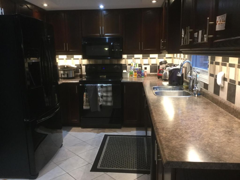
During our first discussion about their project, Eleanor and Jim asked for a consultation. During the consultation, Eleanor complained about how dark the room was, so I suggested painting the cabinets. They shared that they wanted to keep the colour of their cabinets but wanted a countertop renovation only.
Their laminate countertop required replacement because of wear and tear in places. Eleanor shared that she and her husband wanted to replace her laminate countertop with another brown laminated countertop. I suggested quartz because it would be a better return on investment. Since I am a home stager, I always consider the ROI.
I also encouraged them to consider quartz countertops in a light colour; since a light-coloured countertop would lighten and brighten their kitchen, which Eleanor wanted. As you can see from the photo above, the white kitchen counter did lighten and brighten the room!
They were also concerned that it would be hard to clean a lighter-coloured countertop and that it would show streak marks like the granite they installed in their cottage kitchen. I reassured them that it would not streak and would be easy to clean. I talked to Eleanor recently about the countertop, and she did say it was easy to clean and that she loved it!
They also wanted to keep the backsplash. It is challenging to coordinate the countertop colour with the existing backsplash. But it is doable. Ideally, the backsplash should be ripped out along with the countertop since the backsplash can be damaged when removing the kitchen counter. Eleanor and her husband decided to take the risk and it was a success!
Eleanor was so happy with the results that she gave Lynteriors the following Houzz review. Here is what she said:
If you are considering renovating your kitchen in stages, the first step can be to replace or refinish your cabinets. Refinishing tired cabinets and drawers is an efficient option for updating your cupboards and drawers. The ideal solution is to replace cabinets or get professionals to paint your cabinets. Since we are considering a future extension of our kitchen, we decided to repaint them.
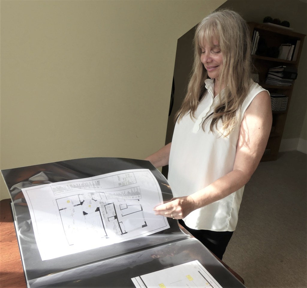
One tip I have for you is to start with a concrete plan for how your kitchen space will look when it’s complete, so the first step is to take the time to create the design for your new kitchen before starting the makeover. Depending on how complex your renovation is, this could be as simple as drawing a simple picture yourself.
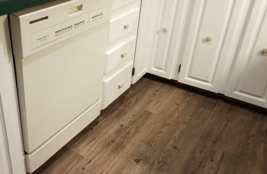
You have many options for updating your cabinets. For example, you can refinish or paint kitchen cabinets like we did. It is less expensive than gutting the existing cabinets and replacing them. After 40 years of wear and tear, water and food stains, our cottage’s kitchen cabinets and drawers needed a renovation. So we decided to paint the original 1980s cabinets and drawers warm white.
We removed the doors and drawers and painted them. You can also replace the hardware and hinges. We opted to keep our existing hinges, but we replaced the knobs with antique bronze button knobs.
New Trend in Renovation: DIY Refinishing
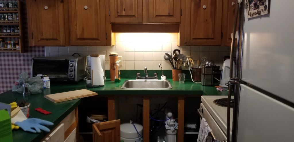
We had been talking about painting our kitchen cabinets or doing a complete remodelling of our cottage kitchen for over five years. So for my birthday, which is in April, I asked if we could do a cottage kitchen project. I said together we could paint the cabinets. I confess Steve did most of it in the end, that is why it was a birthday present. The project would deal with all the ugly water and food stain marks, the wood stain that had rubbed off in places and update the kitchen too.
Furthermore, the kitchen area was dark because it was far from the windows and because of the dark countertop, cabinet doors and dark flooring. The photo below shows how dark the kitchen prep area was. Now you almost need sunglasses on because it is so much lighter. The solid pine wood doors were in great shape except for the stains. So we decided to go ahead with the project. Here is how the kitchen looks now with the lower cabinets painted.
The great thing is this DIY project was under $500! We wanted to make this experience as inexpensive as possible. So it went from dark and dingy to bright and fresh. We get a brand-new look for the fraction of the price we would have spent if we hired a contractor. You, too, can get the beauty you dream of and the affordability you desire for your cabinetry by choosing to do the project yourself as we did.
We considered painting the upper cabinets, but the refinishing of the lower cabinets over a few spring-time weekends took so much of our limited time at the cottage. Instead, we decided to spend the summer enjoying our time there. We are considering painting the upper cabinets in the fall or next year. The laminate countertop replacement, faucet, sink, upper cabinet doors and backsplash replacements are other projects on the list. We are also planning to remove the wallpaper and paint the walls. It may be ten years before we do the extension, so updating our kitchen in stages will work for us.
During the renovation, we found we could use the kitchen without very much inconvenience because we could still get to everything we needed in the kitchen. And now it looks less worn, so I felt better inviting overnight guests this summer. All the guests made a meal in the kitchen, so I felt happy doing so knowing it did not look dingy. And it became one of the rooms everyone congregated in.
Conclusion
The kitchen is more than a room to prepare food in. It is the throbbing heart of your home. During celebrations and get-togethers, family and friends congregate there as they do in my family. So there are compelling reasons why you need to restore your kitchen. With renovating in stages, you can take control of your budget and achieve your desired results practically and efficiently with little interruption. As you can see from the two projects I shared, it is doable. If you are thinking of a kitchen renovation and are considering doing it in stages, and you have questions, contact us.
I, Lynn Asbury, am the founder of Lynteriors which provides interior decorating services in Aurora, Ontario. My passion is making spaces beautiful, comfortable, and suitable for your lifestyle.
With the Christmas season quickly approaching, it’s a splendid opportunity to add some festive touches to your living space with the traditional colours of Christmas. These colours can help create a warm atmosphere that gets you in the holiday spirit. Furthermore, throw pillows with Christmas colours are a budget-friendly way to create a festive Christmas vibe. So, I thought I would discuss how throw pillows with Christmas colours can add to your holiday decor. Next, I’ll discuss another use for throw pillows suitable for any season.
Although it might appear insignificant, adding throw pillows can significantly enhance the look and feel of your living space. These versatile items can make your house feel like a home, and their softness and comfort make them more than just decorative objects. Decorative pillows, like the icing on a cake, are the perfect finishing touch to any room in a home. If your space feels incomplete, a couple of curated throw pillows could create that polished look and bring the entire room together.
Read on to find out how you can use throw pillows:
1. to support your Christmas theme,
2. to provide back support and comfort for you and your family.
Throw Pillows Supports Seasonal Themes such as Christmas
Many holidays are associated with specific colours that have become their signature hues. It is because people have come to associate precise meanings and emotions with distinct colours, to the extent that the mere sight of the colour can evoke those feelings and thoughts without any need for explanation. Additionally, many symbols and colours associated with Christmas have deep Christian meaning and significance, making your decorations all the more meaningful and extra special.
A. Green: A Christmas Colour and Its Meaning
What’s a better way to express your festive spirit than incorporating cozy throw pillows in shades of green, synonymous with the holiday season? Green is one of the quintessential and iconic Christmas colours that immediately instill the holiday spirit in people. To truly understand the symbolic meaning of colours, it helps to look at their religious roots.
For example, green is often associated with evergreen foliage, such as mistletoe and holly, because evergreens stay green throughout the year. They are a symbol of life. So green symbolizes eternal life and immortality, often associated with Jesus.
The colour green reminds us that because of Jesus Christ, we can enjoy eternal life. He came as a baby and died on the cross to give us eternal life here and in heaven. He offers us a life of hope, joy and peace here on earth and for eternity. So many of us, including me, associate green with the life and joy Jesus brings. So, it is part of my Christmas colour palette this year. This photo illustrates how I incorporated green and white pillows into the Christmas interior design of our great room.
B. White: A Christmas Colour and What it Represents
Another popular Christmas colour is white. It is another colour that makes up my Christmas colour scheme this year. So, one tip I would suggest is to choose throw pillows that are the same colour as your Christmas colour scheme, just like I did.
In Canada, historically, Christmas is the holiday that celebrates the birth of Jesus and white aligns with the purity, hope and goodness that his life represents. Jesus is the epitome of the perfect man. He was morally and spiritually pure. Jesus was without moral flaw, just as white is often associated with purity and cleanliness. It is a comparison between the character of Jesus and the symbolic meaning of the colour white. The colour white reminds us of this truth about Jesus.
Furthermore, as the bible points out, those who acknowledge Jesus Christ as their saviour are washed of their moral imperfections and made whiter and purer than they are. So, white reminds us that Jesus made us white, too. Thinking about these truths brings joy in the hearts of believers and, therefore, adds to the festive spirit. So, I used green and white to subtly tell the story of my faith and to remind me of the reason for the season.
Purpose #2: Functionality: Throw Pillows Support Your Back too!
Throw pillows can also offer body support during Christmas festivities and, of course, throughout the year. For example, lumbar pillows help make your couch or armchair more comfortable for your back. Lumbar pillows are designed to support the lower back and can help alleviate lower back pain caused by poor posture or inadequate support. So, throw pillows have a function, too.
Lumbar pillows conform to the natural inward curve of your spine, encouraging sitting in an upright position for optimal spine alignment. Lumbar pillows provide lower back support in seated positions by evenly distributing your weight and removing key pain points, including your back, hips and spine, allowing for muscle relaxation and decreased tension and strain. They do indeed provide health benefits.
On the other hand, square-shaped throw pillows provide full-back support. They’re usually the go-to throw pillow shape and work well on chairs and sofas with uncomfortable backs.
Throw pillows in Christmas colours serve not only a decorative purpose but also a functional one. They complement your Christmas colour scheme, tell the story of your faith in Jesus, who was born at Christmas, and provide spine support. So, they have aesthetic, meaningful, and functional purposes. I hope you all have a joyous Christmas, and who knows, you may now have a different view about green and white throw pillows during Christmas!
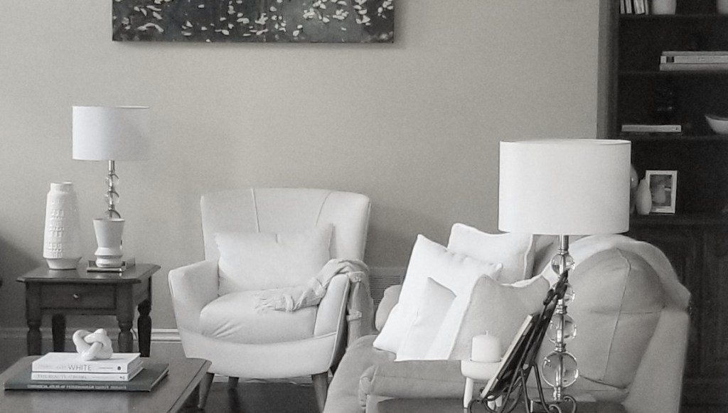
Tip #1: Create Vignettes that Support the Room’s Interior Design Style
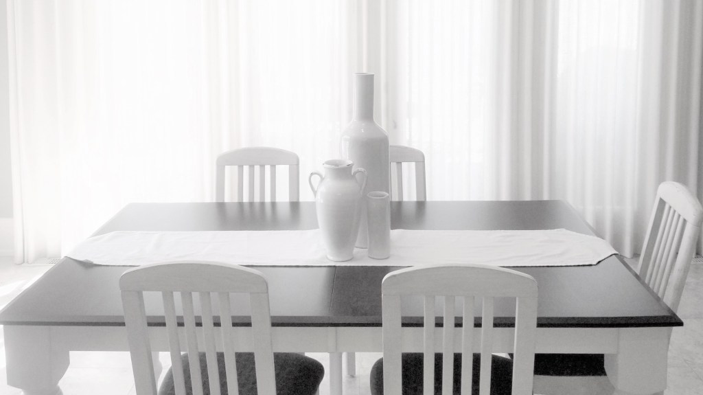
Modern Farmhouse Style Vase Vignette
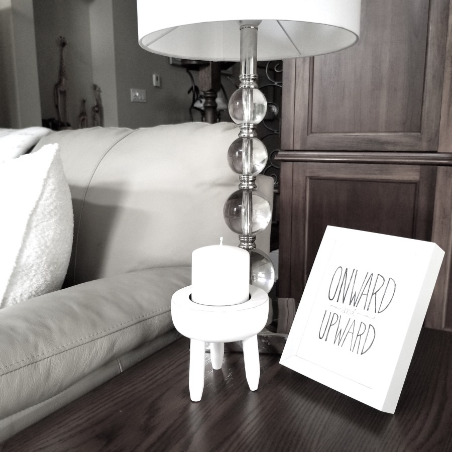
Do you ever feel like your room is missing something after buying new furniture to spruce it up? Sometimes, what’s missing are the small details like table vignettes and accessories that add personality and character to a space. It’s surprising how these little touches can elevate a plain and simple room into something extraordinary. Vignettes have the power to transform a basic, renovated room with just furniture into something special – they can turn a dull space into something magical. Vignettes not only add a touch of sophistication to a room, but they also help tie everything together. They are essential for taking your interior design to the next level and giving your space a polished look. It’s like the icing on the cake in the decorating world as well as the home staging world. Vignettes are easy to design and help create a stunning space you’ll love spending time in. They also support the interior design style of the room.
The Farmhouse table in the photo has a modern look due to its white colour. The tabletop’s white paint has given it an updated appearance, and the white on the vases has also brought a modern touch to the room.
So use vignettes to support the interior design of your room. This vignette combines a rustic European farmhouse vase and mid-century modern-style vases to create a modern farmhouse look.
Arranging objects into vignettes or groupings is a great way to add designer-worthy style to your home too. So, add a vase vignette to your breakfast room or dining room table for a nice touch.
What is an Interior Decorating Vignette
In the realm of interior design or decorating, as well as home staging, a definition of a vignette is:
a small arrangement of objects grouped;
to tell a story;
and to create or support a style or theme in the room
So a vignette is a small-scale composition that tells a story through the arrangement of objects. As this is happening, it adds artistry to a space. Vignettes are beautiful on flat surfaces such as end tables, dining tables, coffee tables and shelves. A vignette is often a table arrangement that tells a story about you and your home. As such, it is a full-scale design in a small-scale space. And it is also an inexpensive way to update a room.
Tip #2: Refresh Your Space with Vignettes
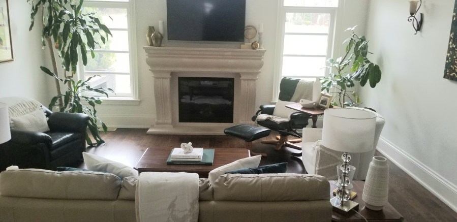
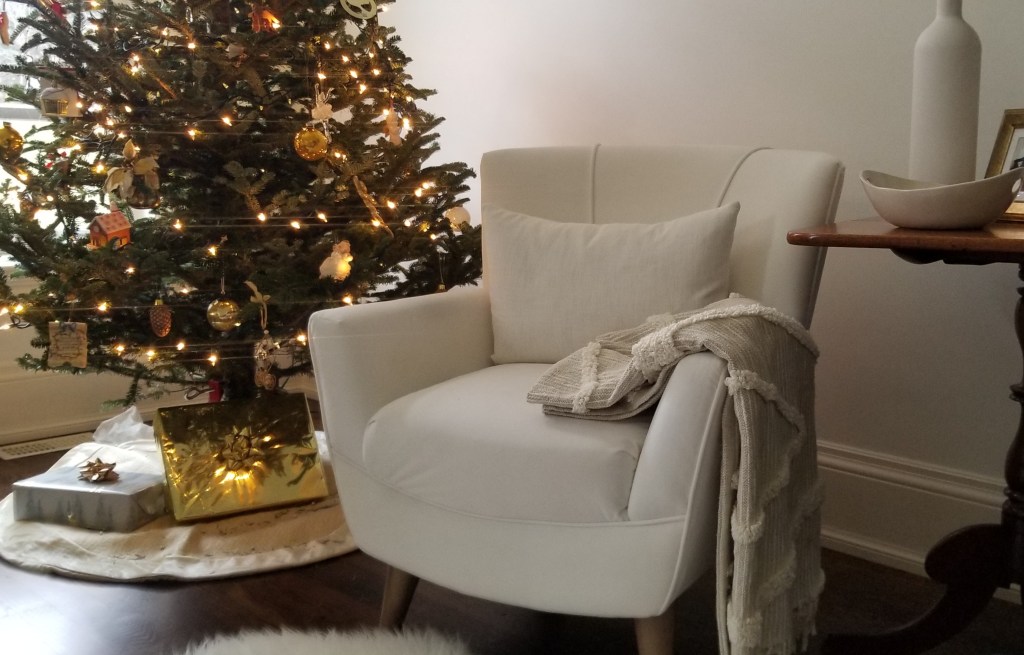
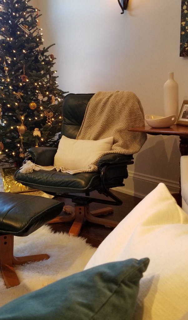
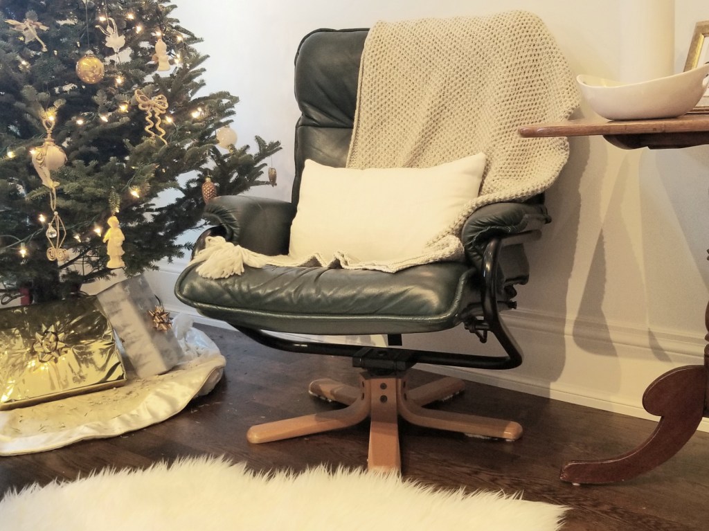
My husband prefers traditional or country furniture, while I have developed an appreciation for more modern designs. In the past, I used to enjoy classic and country-style furniture like my partner, which is why our great room currently features an end table with a more farmhouse feel. However, as I’ve become more interested in modern interior design styles, I recently purchased a modern lounge chair for our great room that more suited my taste. Now, our great room reflects both of our tastes again.
I am 5’2″, while Steve is 6 feet tall. I recently purchased a white lounge chair that fits my stature perfectly. However, to coordinate the chair’s organic modern design style with other items in the room, I realized I needed to update the room with more white accessories. I opted for contemporary pieces to complement the chair, the modern sofa, and another modern lounge chair (not shown in the photo). The new decor pieces gave the room a refreshing, updated and contemporary vibe.
The white lounge chair and vignettes have given a refreshing update to our great room, proving that redecorating a room doesn’t have to be overwhelming!
Tip #3: Use Vignettes to Support the Colour Scheme of the Room
Neutral Colour Scheme and White Accessories
Accessories play a crucial role in enhancing your interior design. The photo above serves as an excellent example of how white tabletop accessories can brighten and uplift a great room. Similarly, the white accessories on the shelf create a beautiful contrast against the dark wood. The objects used to create the various vignettes in the room perfectly complement the contemporary farmhouse style and the room’s neutral colour scheme. Without a doubt, these accessories contribute significantly to the overall design. Moreover, modern white accessories are a cost-effective way to give your space a refreshing, lighter, brighter, and updated look.
Summary:
A cost-effective and simpler method of sprucing up your interior design and colour scheme is using vignettes. It also serves as a means of renewing the overall appearance of your space. If you enjoyed this blog, you may want to explore other ways to enhance your interior design know-how. Lynteriors’ upcoming blog will focus on throw pillows.