Minimalism has gained popularity for a number of reasons. The minimalist interior design style is more than just a design choice. It is a lifestyle that invites peace into your everyday life. By transforming your spaces into serene sanctuaries, minimalism offers a much-needed refuge from the chaos of our busy and stressful world. Plus, it’s an affordable approach, making it accessible for everyone, regardless of budget. Join the growing number of people who have embraced the style and discover the profound joy of living in a clutter-free, serene home!
The allure of minimalism lies in its ability to transform your space into a calming retreat, providing much-needed relief after a hectic day at work. This scenario I will share with you next will help you see what I mean. Imagine coming home after a long, hectic, exhausting day at work and stepping into a sanctuary that exudes peace and serenity. The minimalist interior design style transforms your home into such a haven where calmness reigns and relaxation flourishes.
By embracing minimalism, you can transform your living space into a serene oasis that soothes your mind and reduces everyday stress. An uncluttered environment with simple furnishings fosters mental clarity and peace, which is why homeowners are turning to this design style and lifestyle choice.
Additionally, the furniture and accessories used in this style are often straightforward to manufacture, making them less expensive. Consequently, purchasing minimalist items are more affordable. Therefore, minimalist design is a smart option in today’s challenging economic climate. Embracing minimalism means choosing a lifestyle prioritizing serenity without straining your finances. Read on to find out how another characteristic of this style helps to bring this style into your space.
Element of Minimalist Design#2: Clean-Lined Furniture and Tips
One of the defining characteristics of minimalism is the intentional choice of furniture and decor that showcase clean-lined, geometric shapes—think circles, rectangles, and squares. By opting for pieces with sleek lines and minimal ornamentation, you embrace a minimalist aesthetic. Furthermore, you transform your living space into a serene sanctuary. Consequently, this furniture and decor contribute to a calm and relaxing environment at home, especially after a long day at work. Consider the following tip to achieve this.
Tip#1: How to Incorporate Clean-Lined Furniture
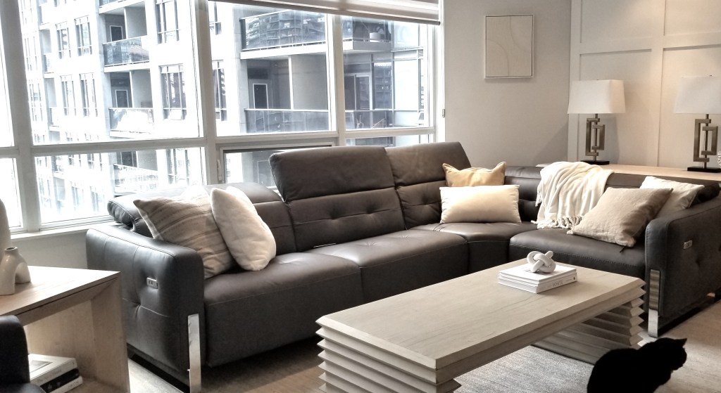
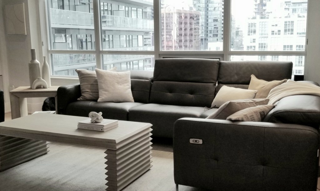
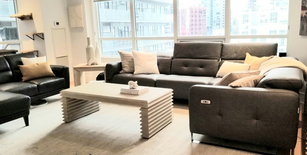
Select furniture that resembles the pieces in the photo above. For instance, pick a piece similar to the square side table, which features straight lines and is unadorned. The furniture’s strong, clean lines create bold statements that emphasize the essential beauty of each piece. Most of the furniture in the photo have straight, clean lines, including the legs of the coffee table. The leg design creates visual interest while maintaining a straight-lined and sculptural appearance. Another important characteristic of this design is the neutral colour scheme. The walls, furniture and accessories have this neutral colour scheme. Click the following link to find out more about this important element of minimalism: https://lynteriors.ca/2025/01/10/minimalist-interior-design-elements-part-a/
Minimalist Design Style and Clean-Lined Decor Tips
Let’s turn our attention to the types of accessories that complement your minimalist interior space. It’s vital to minimize visual clutter on the accessories so that you achieve a truly serene and calming atmosphere. So, the right accessories are essential when crafting a stunning minimalist space.
Tip#2: How to Incorporate Clean-Lined Accessories
My advice is to ensure that- like the furniture- these accessories feature clean lines—either straight or curved—and avoid any ornamentation. Notice how the white ceramic knot and simple vases exemplify this approach. Their smooth curves and unadorned surfaces enhance the overall aesthetic and embody the essence of minimalist design.
The three vases captivate as stunning individual sculptures, showcasing sleek, curved lines free from embellishments. Their elegance shines through the absence of embellishments, allowing their unique shapes to take center stage. The combination of clean lines and lack of visual clutter on the vases contributes to an overall minimalist aesthetic. These pieces embody a true minimalist design.
If you’re ready to elevate your home with the serenity of minimalism or transform your home with another interior design style, I would love to assist you! Plus, you can take advantage of an incredible opportunity to save up to 30% off furnishings! And at Lynteriors we work with Canadian furniture and decor manufacturers. To find out how to contact Lynteriors for more information, please click the following link. https://lynteriors.ca/contact-2/
I, Lynn Asbury, am the founder of Lynteriors which provides interior design and decorating services in Aurora, Ontario, and the surrounding area.
The owners of this condo wanted to lighten and brighten their dark east-facing living room. The first photo below is the before photo of the living room. And an after photo is below it. With so many white accessories including the rug and the table lamps on the console which you cannot see, the room looks lighter and brighter.
They also voiced a desire to go with the minimalist interior design and mentioned during the consultation they wanted a white and gold /yellow colour scheme. I suggested furniture and a rug that would work with their voiced preferences. These are photos that were taken during the styling day. The husband like the neutral white and gold colour scheme. The wife was leaning toward a red colour scheme for various reasons so it was styled both ways. You can see the two colour schemes in the collage below.
If you’re ready to elevate your home with the serenity of minimalism or transform your home with another interior design style, I would love to assist you! Plus, you can take advantage of an incredible opportunity to save up to 30% on furnishings!
Minimalist Interior Design Style and the Neutral Colour Scheme
Now that spring has arrived, you may be considering updating your house in the popular minimalist style, but you’re worried it might seem too stark. The foundation of minimalism is a subdued or neutral colour scheme. But you may find a neutral colour scheme boring.
So the question is: are these guidelines regarding the foundation of minimalism unchangeable? No, the rules can be bent. Minimalism doesn’t have to be void of color. While many minimalist living rooms feature neutral colour schemes it’s entirely possible to embrace a brighter shade. Increasingly, minimalist spaces are incorporating colour. In fact, in 2025, accent colours are seen as a growing trend in minimalist homes. A single accent colour in a room can be quite effective. Read on to discover how accent colours can inject interest in a minimalist room.
Can you Enliven Minimalism with Splashes of Colour?
As we have seen the answer is yes. By thoughtfully incorporating accent colours, you can infuse depth and visual intrigue into your design, all while maintaining a harmonious aesthetic that captivates without overwhelming. A little colour can pack a big punch. So, you can bring in small amounts of accents colours that’ll make a statement in subtle ways. I will illustrate what I mean by using my recent client’s Toronto living room condo as a case study.
Neutral colors such as white, gray, and muted shades such as light gold are the cornerstone of elegant minimalist interior design styled spaces. These shades evoke a sense of openness, light, and calm, transforming any space into a serene retreat. If you want to find out more about the neutral colour scheme and how important it is to the minimalist interior design style, click the follFor instance, you may like minimalismowing link: https://lynteriors.ca/2025/01/10/minimalist-interior-design-elements-part-a/
The husband liked the serene feel of their living room space after it was styled with the classic minimalist colour scheme that included the white, yellow and gold accessories. You can see a photo of the living room’s colour scheme below.
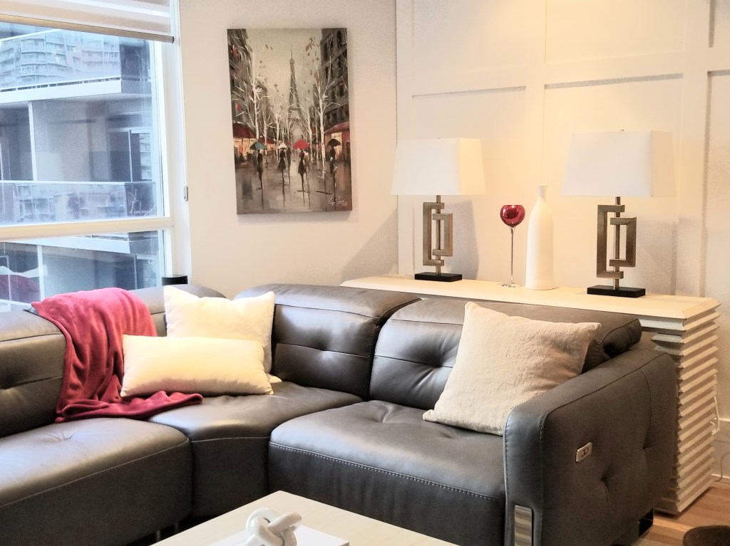
Despite her initial preference for yellow and white, the wife was also thinking about using red to highlight a special red wine glass that her mother had given her at their wedding. Additionally, she cherished her beloved red wall art and wanted to keep it. These two items brought her joy. These accessories showcase the homeowner’s romantic personality and ideals. For example, the goblet showed that she valued romance, marriage, and family. So, It’s vital to consider incorporating these items in the interior design to reflect the homeowners’ personalities. The wife also intended to use these red object to infuse the space with energy.
So, we went ahead and styled their living room with pops of red too. Accessories can bring colour to a space in a meaningful, intentional way and that is exactly what we did. Therefore, to avoid starkness, consider a few small pops of red, as shown. If you are a fan of minimalism but want try to avoid a stark look then pops of colour will do the trick. You can see from in the photo below that pared back minimalist colour scheme and adding a hue with a bit of vibrancy don’t have to be mutually exclusive.
In addition to supporting one of their favorite color schemes, these items have sentimental meaning for the homeowners. They can now choose between these two color schemes They could even manage to incorporate both!
1 How to Tip for Incorporating Accent Colours into a Minimalist Room
Provided the space feels calm and relaxing, minimalist living rooms aren’t limited to neutral color palettes. Now I will share everything you need to know to achieve a minimalist interior with pops of color. My first tip is you too can add pops of colour by adding red accessories that are dispersed around the room like you see in the photo.
Odd numbers of items grouped together are pleasing to the eye, so use three items that are red and sprinkle them around the room. And repeating these colours in a room creates a more structured look.
So accent colours can be strategically introduced to enhance visual appeal and individuality without overwhelming the space. Select colours that enhance your neutral foundation, adding visual appeal without overdoing it, for instance, a few red accessories as shown in this living room image. The red throw blanket, red in the wall art and red glasses added a splashs of colour in the neutral white, ivory and gray living room. The red accent colour pops against their neutral colour scheme. Furthermore, the red accent colours sprinkled around this part of the room adds a touch of warmth, drama and refinement, making the space both stylish and cozy.
Accent colours can be introduced to enhance visual appeal without overwhelming the space. Select colours that enhance your neutral foundation. For instance, add a few red accessories as shown in this living room image. The red throw blanket, the red wall art and red wine glasses added a splash of colour in the living room. The red accent colour pops against their neutral colour scheme. Furthermore, the red colours adds a touch of warmth, drama and refinement. The addition of these red accessories makes the space both stylish and cozy.
Are you interested in discovering the kitchen trends of 2025 that will stand the test of time? If so, read on. In Part 2, I discussed our choice of a wood countertop for our kitchen and about renovating in stages. If you want to learn more about renovating in stages, click the following link: https://lynteriors.ca/2024/12/03/renovating-your-kitchen-in-stages-part-two/
In this post I will continue talking about wood finishes such as wood countertops and flooring as an example of the 2025 trend toward kitchens with wood finishes. Furthermore, this post will explore a cabinet trend, and a backsplash style and colour to consider for a timeless look that will last for decades.
Timeless Kitchen Trend #1: White Kitchen Cabinets
Is White Still a Great Choice for Cabinets? Absolutely!
White cabinets are a timeless classic that will elevate your kitchen for years. Here’s why you should consider them:
Timeless Elegance: White cabinets effortlessly transcend fleeting design trends, ensuring your kitchen remains chic and relevant as styles evolve.
Unmatched Versatility: Whether your colour scheme preferences leans towards bold bursts of colour or soft, muted tones, white cabinetry seamlessly integrates with any design aesthetic or colour scheme choice, giving you endless possibilities.
Illuminating and Spacious: The reflective qualities of white create an airy atmosphere, making even the coziest kitchens feel open and inviting.
Enhance with Warm Wood Accents: Infuse warmth into your space by pairing white cabinets with natural wood tones in your flooring, countertops or shelving, creating a perfect balance of modern and earthy warmth or rustic charm.
Choosing white cabinets is more than a design decision; it’s an investment in a bright, stylish, and welcoming kitchen that you’ll love for years to come! A kitchen designed with white materials is a timeless choice that perfectly complements any style, from traditional to modern.
Discover our white kitchen idea, perfect for inspiring a warm and welcoming atmosphere in your home. While small white kitchens may not always steal the spotlight like other design trends, their practicality is unmatched. Furthermore, the colour white has a remarkable ability to create an illusion of spaciousness, making even the tiniest kitchens feel open and airy. Additionally, this versatile and timeless hue seamlessly complements the bright, inviting wish you may have for your kitchen, making it the ideal choice for your culinary haven. Embrace the beauty and functionality of a white kitchen and transform your cooking space into a true sanctuary!
When we planned our kitchen renovation, which was purely cosmetic, I focused on creating a bright and airy space. I envisioned white cottage kitchen cabinets because white is a timeless choice. White complements any interior design style, including a modern cottage aesthetic. Additionally, it fits well with various colour schemes, especially with the white and wood tones we wanted in our kitchen.
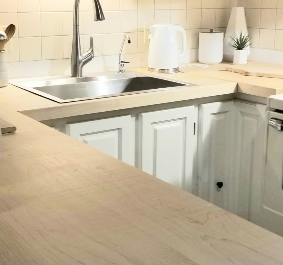
I initially preferred white quartz for the countertops. But, my husband favoured the warmth of wood to give the kitchen a rustic feel. We compromised and decided on a combination of white cabinets with wood accents. We painted our lower cabinets two years ago, and last year, we installed a blond-toned maple wood countertop. The photo below shows the difference white cabinets can make in a kitchen. You can see what I mean by comparing our darker kitchen below with all the after photos.
Timeless Kitchen Trend #2: Wood Floor and Countertop Finishes
As we enter 2025, it’s the perfect time to discuss the exciting trends shaping our homes. Another notable trend is the resurgence of wood finishes in kitchens such as wood -toned flooring and countertops. Wood is here to stay!Consequently, transforming your kitchen into a warm and inviting space is easy with the current popularity of wood tones. Earthy neutrals, particularly those derived from wood, are now at the forefront of kitchen design. Wood tones create a warm palette that adds a natural, grounded feel to the space. Additionally, there is an increasing preference for textured surfaces, and wood naturally provides this by introducing subtle textures through its grain.
Wood finishes are a definitive trend in kitchens that never really goes out of style. Along with white cabinets, wood finishes are timeless. Combining wood countertops and flooring with classic white cabinetry creates a striking look that endures for decades. Opting for warm wood tones like blonde and chestnut enhances the kitchen’s atmosphere and elevates its elegance. Furthermore, homeowners recognize the beauty and durability of high-quality hardwood, laminate, or vinyl options. Embrace this timeless approach for a kitchen that truly stands the test of time.
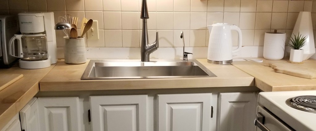
Imagine the stunning effect of mixing various wood tones. We achieved this by pairing a beautiful blond-toned maple countertop with rich chestnut coloured laminate flooring, which beautifully echoed the warmth of our chestnut-toned wood ceiling beams. The combination of crisp white cabinetry and richer wood finishes creates a striking visual contrast that is both modern and timeless.
The brightness of the white cabinetry opens up the space, while the wood introduces natural warmth, texture, and coziness, softening the overall look and grounding our kitchen. This pairing strikes the perfect balance between minimalism and cozy comfort. A white and wood kitchen pairing offers timeless elegance and a clean, balanced design that feels inviting. Blond wood has a yellow undertone and yellow is the lightest true colour. So our blond-toned wood countertop top lightened and brightened our kitchen further. The photo below shows you what I mean.
Furthermore, the striking contrast of white and wood offers remarkable versatility to any kitchen style you prefer, whether modern, minimalist, traditional, or cottage-inspired. For example, our cottage kitchen beautifully exemplifies this combination. The white cabinetry creates a welcoming neutral backdrop, allowing the rich textures and tones of the wood to stand out. Wood elements add depth and character and enhance the overall aesthetic without overwhelming the space.
Trend # 3: White Subway Tile
A third timeless kitchen trend that remains popular is white subway tiles. Choosing a neutral backdrop with white kitchen cabinets and a white backsplash creates a versatile canvas. A white backdrop allows you to introduce vibrant pops of colour or change the colour scheme in the future, adding a dynamic element to a pristine white aesthetic. Adding colour to your accessories such as your canisters can add those pops of colour.
Remarkably, white subway tiles, once a staple of the 1980s, continue to dominate design in the 2020s. This holds true in our 42-year-old cottage kitchen! Our kitchen features white square subway tiles, and we are committed to keeping them. Their timeless elegance ensures they will remain a beloved choice in kitchen design for years to come. These tiles offer a classic look that has been popular for over a century, proving that subway tiles have stood the test of time.
Warm white subway tiles are the perfect combination of elegance and contemporary flair. Available in rectangular and square shapes, these tiles exude a timelessness that enhances your home’s aesthetic. Not only are they stunning, but they are also incredibly durable and easy to maintain, making them a wise investment for kitchen backsplashes. Their sleek, clean lines and versatile neutral colours blend with many design styles. Whether your style leans toward industrial, modern, contemporary, cottage kitchen, or traRead about three 2025 kitchen trends that will last longer than a few years. Learn all about the modern cottage style too!ditional, warm white subway tiles will enhance the beauty of your kitchen and create an inviting atmosphere that you’ll love for years to come. White subway tiles are a classic yet contemporary tile!
Selecting warm white kitchen cabinets and white subway tiles creates the ideal look for your modern cottage, offering a clean and simple backdrop. You can see this in the photo below. Warm white or light beige subway tiles feature softer, warmer tones that blend seamlessly, enhancing a more natural and cohesive aesthetic—perfect for modern cottage kitchens and rustic-inspired spaces as well as minimalist and modern contemporary kitchens.
Additionally, classic subway tiles add visual interest without being overwhelming, helping to make your kitchen appear more spacious. Glossy glazed white subway tiles also reflect light, adding luminosity and further brightening your contemporary kitchen or like in our case a modern cottage kitchen.
Ceramic subway tiles have a glossy texture that can enhance the overall appearance of your space. While incorporating colour adds dynamism, adding texture is equally impactful, especially with a more subdued colour palette. Look for opportunities to mix and match materials and textures like we did. For example, our matte white cabinets pair well with our wood countertops and flooring which added a wood-grain texture, creating a harmonious balance of textures. These materials beautifully complement glossy textured white subway tile backsplashes.
It’s important to consider that using rectangular tiles, like the ones we have, can create a casual atmosphere in the kitchen. And a rectangular or square warm white subway tile backsplash could complement your countertops, cabinetry, and overall colour scheme, resulting in a cohesive and stylish look—just like we achieved.
Conclusion: Modern Cottage Style and 2025 Trends
Transforming your kitchen into a modern cottage style creates a perfect blend of warmth, practicality, and sophistication, making it an inviting and refreshed hub in your cottage or home. This style combines the charm of a traditional cottage with the sleek look of a contemporary design style. Imagine combining the comforting charm of a traditional cottage with the sleek efficiency of modern design—resulting in a kitchen that looks stunning that is a pleausre to be in.
If you’re thinking about a kitchen renovation in a modern cottage style or using any other interior design style , don’t let the idea overwhelm you—especially if you’re working with a small space. Smaller areas can make the transformation more manageable and cost-effective. By taking a focused approach, you can create a unique and inviting kitchen retreat without the burden of excessive time, effort, or expense.
Furthermore, if you’re aiming for a kitchen design that never goes out of style, opt for white cabinets paired with warm white subway tile backsplashes. Incorporating wood finishes, such as beautiful wood flooring, can add a touch of warmth and character. And wood flooring never goes out of style. Don’t overlook the resurgence of wood countertops—these elements create a stunning, timeless look that will elevate your kitchen for years. But wood countertops which are trending, may not be as long a lasting trend.
If you are ready to refine your kitchen with expert guidance, Lynteriors is here to help turn your vision into reality. Lynteriors personalized advice covers everything from tile and flooring selections to cabinetry and colour coordination, ensuring your style preferences and needs are met. If you are embarking on a kitchen renovation, Lynteriors will provide insights that guarantee a seamless blend of beauty and functionality in your dream kitchen. Embrace the transformation—your ideal kitchen awaits! Contact Lynteriors to find out how we can work together to creating your dream kitchen! Click the link below to contact Lynteriors: https://lynteriors.ca/contact-2/
I, Lynn Asbury, am the founder of Lynteriors which provides interior design and decorating services in Aurora, Ontario, and the surrounding area.
You may be wondering, what is minimalist interior design? Well, clean lines, uncluttered simplicity, and “less is more” embody this style and it is a lasting interior design aesthetic rather than a trend. Secondly, a minimalist living room promotes a calming atmosphere. This style emphasizes simplicity while creating a warm and welcoming environment without excess. And, it focuses on functional furniture and essential elements, making every piece purposeful. Furthermore, one of its key attributes is a neutral colour scheme enhanced by thoughtful textures and patterns. All of the characteristics of minimalism create a soothing and inviting space that has a timeless aesthetic. For instance, my clients in Toronto chose sophisticated neutrals like white, ivory, and black, proving that minimalism can be elegant and inviting.
In this blog, I will highlight a key aspect of minimalist design: the power of a neutral colour scheme. Discover how this simple yet impactful choice can transform your space and create a sense of calm and balance. Read on to learn more!
So, the Key Characteristics of Minimalist Interior Design are:
Less is more: creating a serene, uncluttered space
Incorporation of functional furniture and essential elements
Use of clean lines
Neutral colour scheme
Neutral Colour Scheme Tips/Ideas
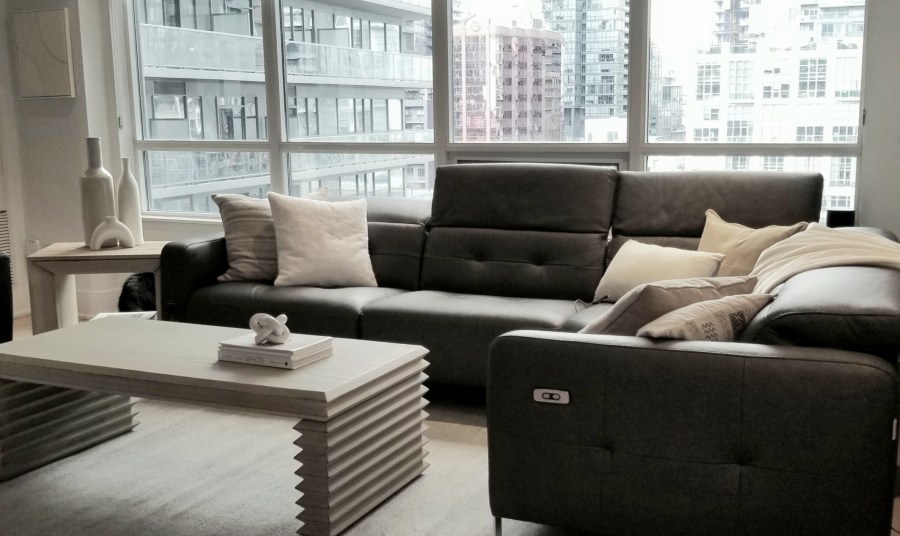
A neutral colour palette is a defining feature of minimalist interior design. Minimalist colour is a simple, pared-back approach to colour in interior spaces. The philosophy behind minimalist colour schemes is elegantly straightforward: less is more. By using subdued hues that make up a neutral colour scheme, such as warm whites, cream, ivory, gold, beige, gray, and black, you create a serene and uncluttered atmosphere that promotes tranquillity. These colours are essential for establishing a minimalist design that feels both modern and inviting. In the living room of the condo owners, which is shown in the photo above, this neutral colour scheme had made an impression, particularly on the husband, who liked it.
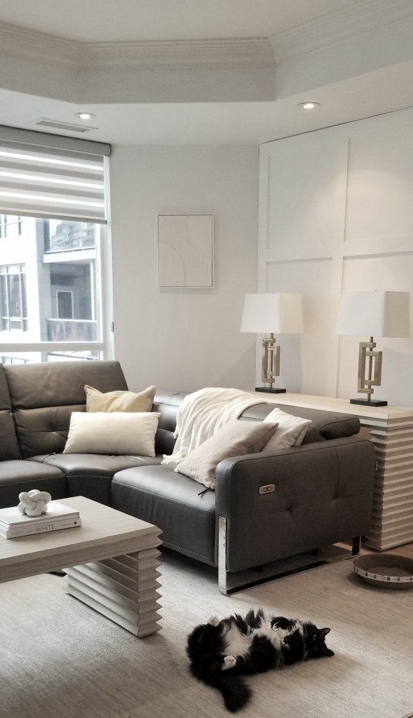
Minimalism in interior design focuses on providing a simple, clean, and elegant backdrop. The wall paint colour is an ideal medium for establishing this background or canvas to build your design. For instance, you can paint your walls a white hue to achieve a simple and clean look, similar to the paint colour already in the room, as shown in the photo above.
Additionally, minimalist design often incorporates neutral-coloured materials, with black and white as the primary tones. For example, this condo-it features white walls paired with luxurious black leather on modern sectionals.
How to Incorporate Shades of White and Yellow-Gold?
A well-curated minimalist colour scheme typically features three to four variations of the same neutral hue. For instance, the pillows and the side table feature different shades and tints of yellow-gold, which together create an elegant, sophisticated, and restful atmosphere. By distributing these colours strategically, you’ll find two yellow-gold pillows paired with a yellow-gold side table, creating a cohesive look. Just look at the photo above to see how this design choice elevates the space.
Light colours such as warm white, ivory, sand and light yellow-gold help to make your rooms look lighter and brighter and feel more spacious. They create that light and airy look. During the consultation, this was the colour scheme my clients shared they preferred for the living room’s tables and rugs, which fit in perfectly with the minimalist design they also said they wanted.
They specifically chose a yellow-gold-toned wood side table, a sandy white rug, a white-washed ivory console table, and coffee table to add to their black leather sectionals they already owned. These colors—white, ivory, sand, and yellow gold—help to reflect light in their dark north-facing and east-facing rooms. This design transforms their living area into a more relaxing, lighter, and brighter space. In particular, warm white, ivory, and sandy tones illuminate a room with black furniture. The picture above clearly shows that the room was lacking brightness and lightness. By comparing it with the photo below, you can see how the addition of white pillows transforms the space, making it feel more lighter and brighter. Adding white accents is a simple yet powerful way to uplift any room!
Conclusion
A key minimalist interior design element is a neutral colour scheme, evident in this condo living room. You can choose neutral colours such as black, warm white, ivory and yellow/gold, just like these condo owners did to create a neutral colour scheme in your space. These colours show up on the walls, furniture, rug and even the throw pillows.
A neutral colour scheme also allows other aspects of the room, such as my client’s lovely cityscape view, to shine through. With a neutral colour scheme, the view from the window captures attention and serves as a captivating focal point, as you can see in the photo above. By embracing a minimalist interior, this design highlights the cityscape view and creates a serene, inviting atmosphere, making it the perfect retreat for relaxation or entertainment.
Designing your living room should reflect your personality. In this case, the husband’s preferences leaned towards a minimalist colour scheme and design style, which he liked and aligned with his taste. Meanwhile, the wife also appreciated neutral colours and the minimalist style. But she wanted to introduce accessories that held sentimental value for her and added a splash of colour to the living room. In part B of the minimalist interior design discussion, I will explore how to incorporate accent colours, such as red or blue, into a minimalist design. This way, you can create a space that both of you will love.
Transform your home into a stunning minimalist haven with the expert help of Lynteriors. Don’t let overwhelming feelings hold you back; we are here to guide you every step of the way. We will turn your vision into reality just like we did for this happy couple in Toronto At Lynteriors, we’re dedicated to creating personalized solutions that capture your unique style, using any interior design approach and colour scheme you desire. Let us help you achieve the home of your dreams! Contact us at: https://lynteriors.ca/contact-2/
I, Lynn Asbury, am the founder of Lynteriors which provides interior design and decorating services in Aurora, Ontario, and the surrounding area. Lynterior’s mission is to help you create your dream home.