The kitchen is the heart of the home—so it’s no surprise that its design carries so much weight. At the center of it all are the cabinets, shaping the space through their material, colour, and style. In this renovation, the design challenge began with an existing countertop the homeowner loved. Rather than replace it, we built the palette around it. With taupe-gray and greige leading trends in 2026, we selected a nuanced taupe-greige cabinetry finish that not only complements the countertop, but also reveals subtle undertones that shift with the light—creating a space that feels dynamic, layered, and with an ever-changing look.
Greige: A Study in Undertone
In this project, the cabinetry features a warm greige as its primary tone, layered with soft pink-violet and yellow undertones. These nuanced undertones add depth and warmth, allowing the colour to gently evolve depending on the lighting in the room while maintaining a cohesive, balanced look.
A paint colour’s undertone is the subtle hue that sits beneath the surface colour, often only revealing itself under certain lighting conditions. While the main colour—or mass tone—tells you whether a shade falls into the greige, white, beige, or gray family, the undertone is what truly defines how it reads in a space. Hints of blue, green, yellow, pink, or violet can shift a colour’s appearance dramatically based on the lighting.
Warm greige—an artful blend of gray and beige—has become a go-to choice for those seeking a neutral with a touch of warmth. Softer and more inviting than cool gray, it brings comfort to the kitchen while still acting as a versatile backdrop. It avoids the starkness of white without feeling overly bold, striking a thoughtful balance between the two. This makes it an ideal option for homeowners who want warmth without the washed-out effect that white can sometimes create.
In this project, the wife was naturally drawn to this richer tone, ultimately moving away from lighter taupe-greige options that felt too pale and appeared overly white under certain lighting conditions in their kitchen. The selected shade also complemented the gray armchair in the adjacent family room, helping to create a cohesive and harmonious flow between the open-concept spaces.
What are Mid-tone Colours?
The new cabinet colour selected for this kitchen falls within the mid-tone range—but what does that really mean? On a value scale from pure white to deep black, mid-tone colours sit comfortably in the middle, meaning they are neither too light nor too dark. This balanced quality allows them to avoid feeling overly bright and airy like high-key colours, while also steering clear of the heaviness that low-key tones can sometimes create. Mid-tones can bring a sense of comfort and subtle warmth, creating a space that feels grounded, inviting, and almost cocoon-like. In essence, medium-toned colours strike a beautiful balance between coziness and openness.
As you can see, choosing a mid-tone colour palette offers several advantages—especially when creating an atmosphere that feels both comfortable and tranquil. This Benjamin Moore colour, known as Hazelwood, is a perfect example. Sitting between a dark gray and a very light gray, it falls into the category of a medium gray, making it an ideal choice for achieving that balanced, harmonious look while perfectly suiting the homeowners’ preferences.
What Is Taupe?
Taupe is a versatile and sophisticated neutral that blends grey and brown, often with a subtle pink undertone. It’s considered a true “chameleon” colour, adapting beautifully to its surroundings and shifting in appearance depending on lighting .
Exploring Hazelwood by Benjamin Moore as an Example
Hazelwood by Benjamin Moore is a warm taupe, sitting comfortably between grey and beige, with a soft pinkish-purple undertone. This makes it a modern, softer alternative to stark white or cooler grey cabinets. As part of the brand’s Classic Color Collection, it reflects a sense of timelessness and understated elegance.
The name “Hazelwood” evokes natural elements—like hazelnut trees and warm wood tones—giving the colour a grounded, organic feel. This connection to nature makes it especially well-suited for creating warm, inviting spaces such as kitchens. Much like the trunk and branches of a hazel tree, which can appear pinky-grey or pinky-beige depending on the sunlight, this colour shifts in a similar way within a room. Overall, this shade reflects the growing design preference for warm, earthy, and nature-inspired tones—bringing a sense of comfort into the home. It responds to changing light conditions, reinforcing its chameleon-like quality.
As a medium-toned taupe, it helps create a soothing, warm ambiance—more of a tranquil retreat than a stark, cold modern space. Its inherent warmth brings a cozy feel, pairing beautifully with the wood flooring and existing countertops in the room. This subtle richness allows the space to feel balanced and inviting, rather than overly sharp or sterile—creating a space that is not only visually appealing but also emotionally comforting and welcoming.
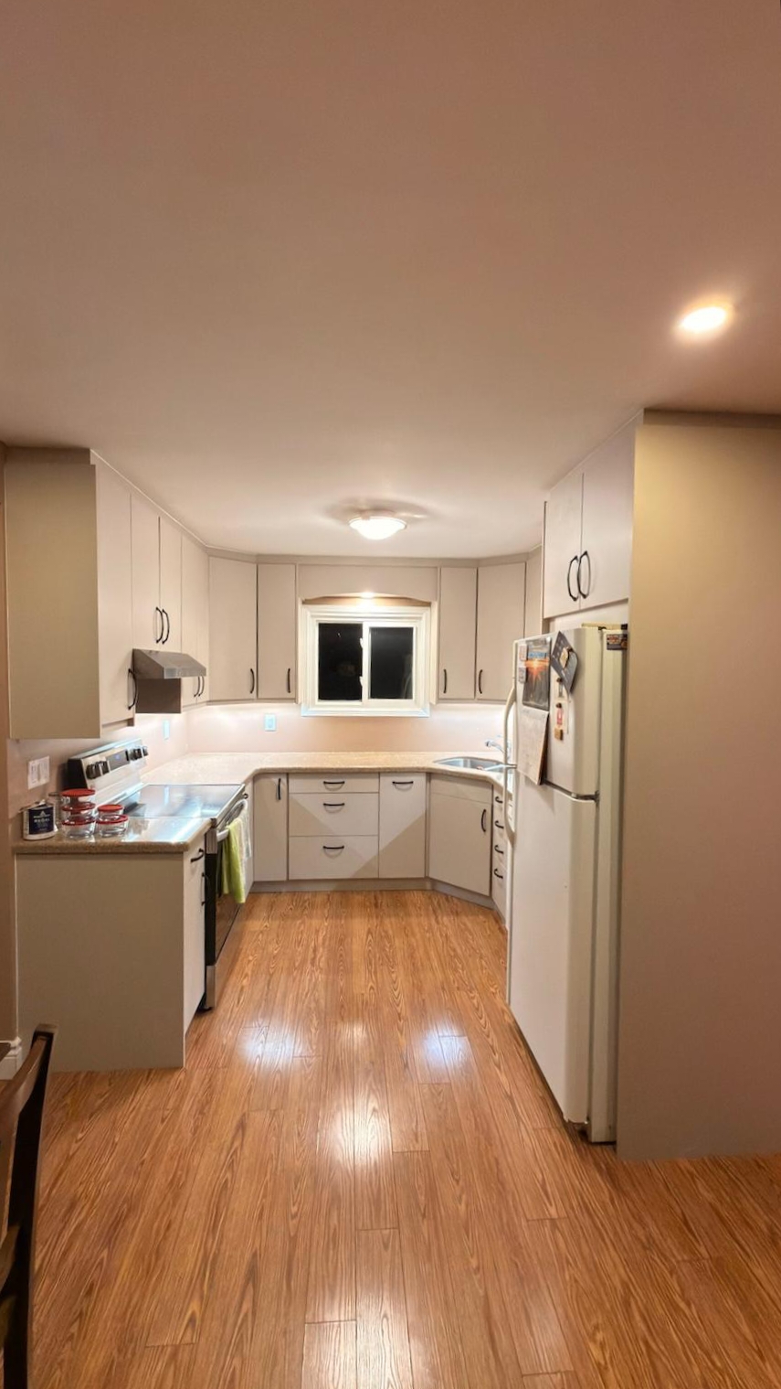
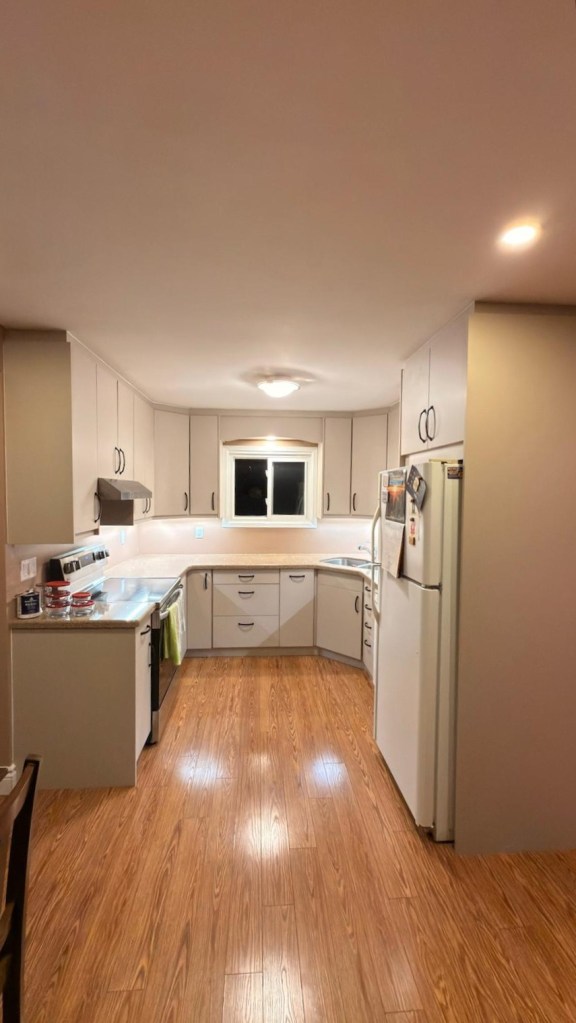
Why does the Same Kitchen Cabinets Appear to have a Different Colour
As you can see in the photos below, the exact same kitchen cabinets can appear to be different colours. Why is that? It’s because Hazelwood contains both beige and gray in a well-balanced way, along with subtle pink undertones and even a hint of yellow.
As a result, it can read as a pinky beige in some moments and a pinky gray in others—depending on the natural light entering the space and the artificial lighting from under-cabinet lights, ceiling pot lights, or overhead fixtures. The colour temperature of the bulbs plays a key role in how these undertones are revealed.
Read on to learn more about how colour temperature influences what you see in your space.
Why Bulb Colour Temperature is Important?
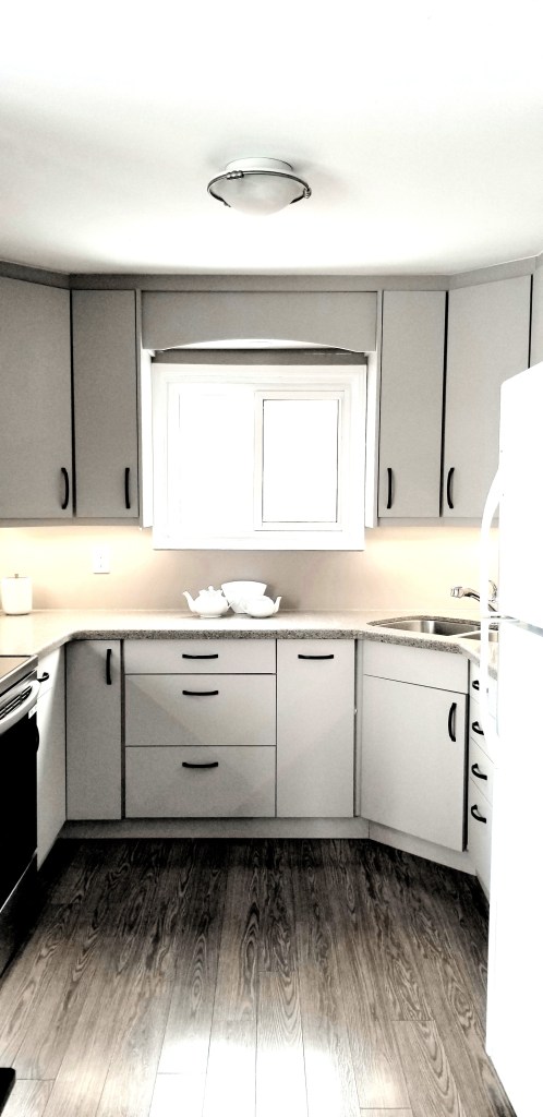
This particular Benjamin Moore colour can appear as a mid-toned taupe-gray in one setting (see the photo above on the left), and shift to a softer, lighter taupe-sandy beige (see the photo above on the right) when a different lighting source is introduced. It’s truly a chameleon shade, changing its colour dramatically depending on the room’s lighting—specifically the colour temperature of both natural and artificial light.
Interior lighting plays an important role in balancing the light coming from outside—whether in terms of quantity or temperature. This is where Kelvin (K) comes in. Lighting colour temperature, measured in Kelvin, directly influences how kitchen cabinet colours appear by either warming or cooling them.
Warm coloured light bulbs(lower Kelvin values) that give off a yellow colour enhances reds, yellows, and wood tones, allowing them to blend harmoniously, while colder light (higher Kelvin values) makes surfaces appear crisper, more defined and enhances grays and blue colours – Kelvins therefore indicates the colour of the light being emitted. Understanding this can make a significant difference in how colours like Hazelwood are experienced in your space.
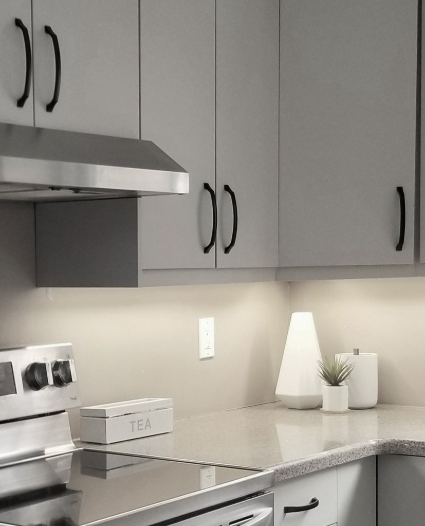
The ceiling fixture and pots lights have bulbs with around 3000K. So in the evening when these light fixtures are turned on the warm pinky beige colours in the cabinets are revealed and you get the mushroom beige colour look that is trending now.
When the neutral-cool 4000K under-cabinet strip lighting is turned on only—often considered a balance between warm and cool light—it shifts the cabinet colour toward a more taupe-gray rather than beige. Similarly, when natural light is cooler, such as on an overcast, grey January afternoon (like in the photo), the cabinets can read noticeably more gray. In this case, it’s the combination of cooler natural light and cooler artificial lighting that creates that taupe-gray appearance in the kitchen.
As you can see, the colour temperature of your light bulbs can make a significant difference in how colours appear within your space. One of the advantages for these homeowners is the flexibility this creates—they can subtly influence how their kitchen looks simply by adjusting their lighting. When it comes time to sell, they even have the unique opportunity to highlight the version of the colour that best aligns with current design trends.
Summary:
Taupe kitchen cabinets that are neither too dark nor too light represent that rare intersection of aesthetic sophistication and practical performance. Their subtle complexity adds visual interest without overwhelming a space, while their mid-tone balance helps them stand up to the demands of daily living—partly because these mid-tones are better at concealing everyday dirt, dust and grease. This thoughtful blend of beauty and functionality helps explain their enduring appeal. A must if you do not want to clean kitchen cabinets frequently.
Hazelwood by Benjamin Moore is a particularly complex shade, often described as a warm taupe-greige. Because of this, it behaves like a chameleon under different colour temperature conditions. This gives you the unique ability to influence how the colour reads—whether leaning more gray or more beige—simply by adjusting your lighting. It’s a subtle but powerful advantage, especially when preparing a home for sale, as lighting can be used to highlight the most on-trend look at the time. These homeowner are considering moving soon so this will benefit them and maybe you if you are considering painting your cabinets this colour.
Just in case you were wondering, the owners refaced their cabinets and chose slab panel cabinets. If you’d like to learn about the slab panel cabinets featured in this kitchen project—and their benefits—click the link below.
https://lynteriors.ca/2026/02/17/refacing-kitchen-cabinets-breathe-new-life-into-your-kitchen/

