
Minimalist Interior Design Style and the Neutral Colour Scheme
Now that spring has arrived, you may be considering updating your house in the popular minimalist style, but you’re worried it might seem too stark. The foundation of minimalism is a subdued or neutral colour scheme. But you may find a neutral colour scheme boring.
So the question is: are these guidelines regarding the foundation of minimalism unchangeable? No, the rules can be bent. Minimalism doesn’t have to be void of color. While many minimalist living rooms feature neutral colour schemes it’s entirely possible to embrace a brighter shade. Increasingly, minimalist spaces are incorporating colour. In fact, in 2025, accent colours are seen as a growing trend in minimalist homes. A single accent colour in a room can be quite effective. Read on to discover how accent colours can inject interest in a minimalist room.

Can you Enliven Minimalism with Splashes of Colour?
As we have seen the answer is yes. By thoughtfully incorporating accent colours, you can infuse depth and visual intrigue into your design, all while maintaining a harmonious aesthetic that captivates without overwhelming. A little colour can pack a big punch. So, you can bring in small amounts of accents colours that’ll make a statement in subtle ways. I will illustrate what I mean by using my recent client’s Toronto living room condo as a case study.
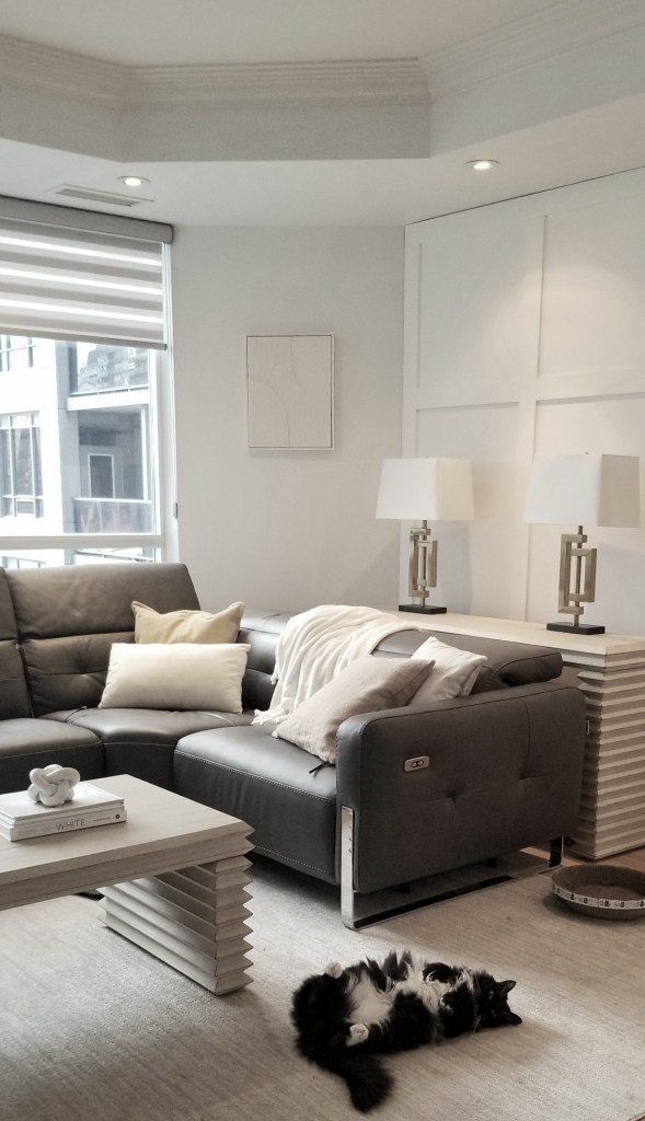
Neutral colors such as white, gray, and muted shades such as light gold are the cornerstone of elegant minimalist interior design styled spaces. These shades evoke a sense of openness, light, and calm, transforming any space into a serene retreat. If you want to find out more about the neutral colour scheme and how important it is to the minimalist interior design style, click the follFor instance, you may like minimalismowing link: https://lynteriors.ca/2025/01/10/minimalist-interior-design-elements-part-a/
The husband liked the serene feel of their living room space after it was styled with the classic minimalist colour scheme that included the white, yellow and gold accessories. You can see a photo of the living room’s colour scheme below.
Despite her initial preference for yellow and white, the wife was also thinking about using red to highlight a special red wine glass that her mother had given her at their wedding. Additionally, she cherished her beloved red wall art and wanted to keep it. These two items brought her joy. These accessories showcase the homeowner’s romantic personality and ideals. For example, the goblet showed that she valued romance, marriage, and family. So, It’s vital to consider incorporating these items in the interior design to reflect the homeowners’ personalities. The wife also intended to use these red object to infuse the space with energy.
So, we went ahead and styled their living room with pops of red too. Accessories can bring colour to a space in a meaningful, intentional way and that is exactly what we did. Therefore, to avoid starkness, consider a few small pops of red, as shown. If you are a fan of minimalism but want try to avoid a stark look then pops of colour will do the trick. You can see from in the photo below that pared back minimalist colour scheme and adding a hue with a bit of vibrancy don’t have to be mutually exclusive.
In addition to supporting one of their favorite color schemes, these items have sentimental meaning for the homeowners. They can now choose between these two color schemes They could even manage to incorporate both!
1 How to Tip for Incorporating Accent Colours into a Minimalist Room
Provided the space feels calm and relaxing, minimalist living rooms aren’t limited to neutral color palettes. Now I will share everything you need to know to achieve a minimalist interior with pops of color. My first tip is you too can add pops of colour by adding red accessories that are dispersed around the room like you see in the photo.
Odd numbers of items grouped together are pleasing to the eye, so use three items that are red and sprinkle them around the room. And repeating these colours in a room creates a more structured look.
So accent colours can be strategically introduced to enhance visual appeal and individuality without overwhelming the space. Select colours that enhance your neutral foundation, adding visual appeal without overdoing it, for instance, a few red accessories as shown in this living room image. The red throw blanket, red in the wall art and red glasses added a splashs of colour in the neutral white, ivory and gray living room. The red accent colour pops against their neutral colour scheme. Furthermore, the red accent colours sprinkled around this part of the room adds a touch of warmth, drama and refinement, making the space both stylish and cozy.
Accent colours can be introduced to enhance visual appeal without overwhelming the space. Select colours that enhance your neutral foundation. For instance, add a few red accessories as shown in this living room image. The red throw blanket, the red wall art and red wine glasses added a splash of colour in the living room. The red accent colour pops against their neutral colour scheme. Furthermore, the red colours adds a touch of warmth, drama and refinement. The addition of these red accessories makes the space both stylish and cozy.

